Definitions of "poverty" always carry some political baggage. But, still, "poverty" is definitely a relative term. From
this site:
We get much more insight, though, once we have a look at what UNICEF means by "poverty rate." In this case, UNICEF (and many other organizations) measure the poverty rate as a percentage of the national median household income. UNICEF uses 60% of median as the cut off. So, if you're in Portugal, and your household earns under 60% of the median income in Portugal, you are poor. If you are in the US and you earn under 60% of the US median income, then you are also poor.
The problem here, of course, is that median household incomes — and what they can buy — differs greatly between the US and Portugal. In relation to the cost of living, the median income in the US is much higher than the median income in much of Europe. So, even someone who earns under 60% of the median income in the US will, in many cases, have higher income than someone who earns the median income in, say, Portugal.
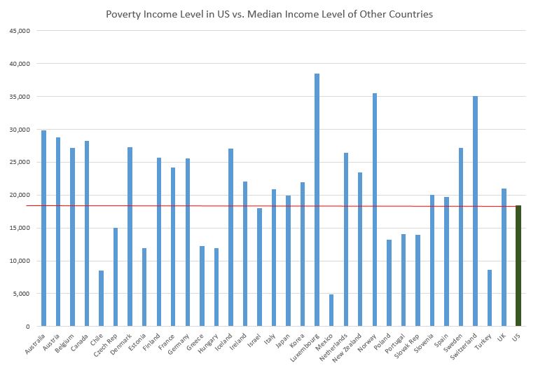
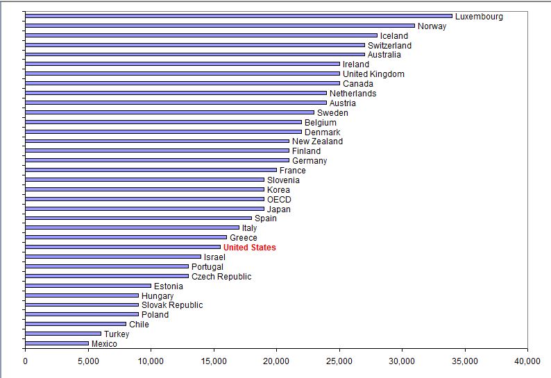
The chart below has been adjusted for PPP, so it is in "international dollars"
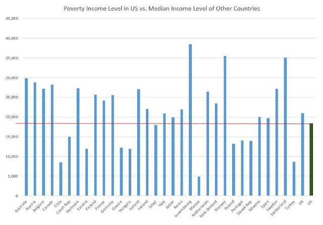
The green bar for the US is the top of the US
poverty level income (60% of median GDP). The blue bars for the other OECD countries are the
median incomes in those countries. Again, all in these PPP dollars. US median income would be $30K, only 3 of the 32 other nations have higher median PPP adjusted incomes.
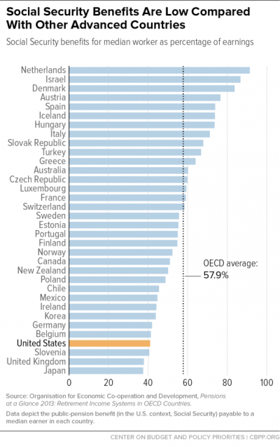
Or maybe that calculation would have the opposite effect to what you're expecting. Social Security equivalents (the US is not unique among OECD countries) appear to be more valuable in almost every other OECD country. So the US "middle class" might be SMALLER if anything.
For the interested reader, it would be a simple thing to multiply the median incomes above by "median SS-replacement rate" shown in the graph you provided to find out if the US median worker comes out ahead or behind other OECD nations in the this measure of wealth. Example: If 60% of US median is about $18K (from above graph), then the US median income is $30K. SS replacement is about 42% (from your chart), so that's $12,600 PPP dollars. If we look at France, they have a median income (see above chart) of about $20K, and so even with a comparatively very "generous" SS replacement ratio of about 58%, the SS amount comes to $11,6000 per year, or about 8% less than the median US SS check. Again, already converted to PPP. So, at least when comparing median income workers, it appears SS checks to US retirees are larger than to their French counterparts (in comparable dollars), and so do more to raise their relative wealth and any associated relative international rankings based on that income.
But, in the bigger picture, if the poor in the US can have have a higher income (again, on a PPP basis) than the median income in many OECD nations, then it seems likely that most people in the US have had a better opportunity than those in most other OECD nations to amass some savings and net worth (back to the metrics in the OP). If they have chosen not to do so and now have low net worth...that's what freedom is about. I'm sure they recognized the ramifications when they made their choices.