Midpack
Give me a museum and I'll fill it. (Picasso) Give me a forum ...
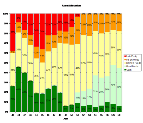
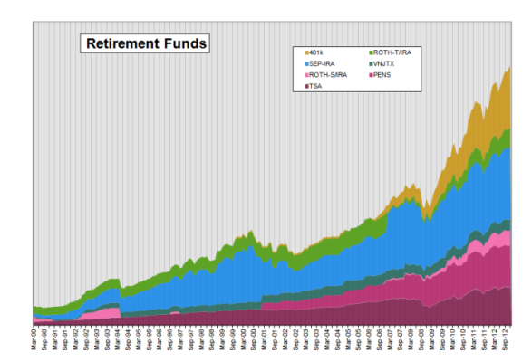
Not sure why in retrospect, but I took a much closer look at my longer investing history today and found that I was not as aggressive as I recalled (old brain cells) and haven't been as disciplined as long re: rebalancing as I thought. However, the fluctuations would make more sense if you knew the $ accumulations (which I have not shared) and the tax implications each year. Avoiding taxes was always a higher priority to me than rebalancing. More often than not I "rebalanced" with new contributions to avoid buy/sells which takes a while, especially after a big market move up/down.
Cash allocation was somewhat of a surprise, though an emergency fund naturally accounts for a lower % of assets with age/portfolio size (partial explanation). And I did consciously move $ on/off the sidelines when I was trading individual equities.
Anyway, it's not pretty when I see it like this. No real lesson that I can see, just purty colors. Too soon old, too late smart.
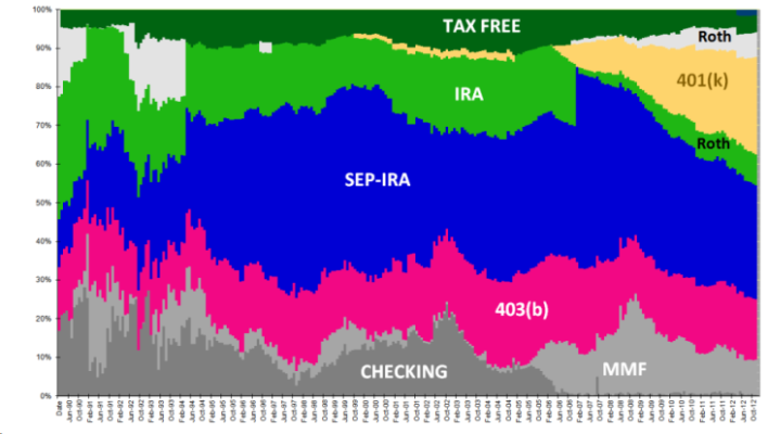


")