Morningstar chart showing history of bull markets

REWahoo

Give me a museum and I'll fill it. (Picasso) Give
Joined
Jun 30, 2002
Messages
50,032
Location
Texas: No Country for Old Men
Bearish calls ... might make you worried about the U.S. stock market, which is more than five years into its bull run that began March 2009.

But a chart created by Morningstar Inc., the Chicago-based investment research firm, shows bull markets often have lasted for more than five years.
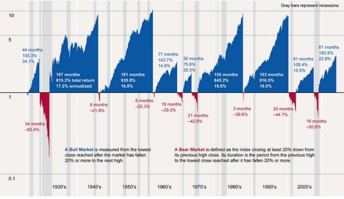
This chart may make you less worried about U.S. stocks

My razor-sharp analytical skills immediately focused on the fact there is a lot more blue than red...:)
 

Attachments

  • A history of bull markets in one Morningstar chart.JPG
    A history of bull markets in one Morningstar chart.JPG
    64.3 KB · Views: 202
There was some argument at M* that this graph left out a couple of bear markets, but still!
 
The Federal Reserve came about as a reaction to the panic of 1907. Didn't fix everything though.
 
This chart looks 'awfully' good. If the market is this good, why do we worry about not being able to afford early retirement?

It bothers me, because it appears to be in conflict with other info, for example FIRECalc that tells us there were tough periods in the past.

Then, it occurrs to me that the chart shows total returns, but before inflation! Subtract out the loss due to inflation, then perhaps the "blue" areas are no longer so impressive, and the "red" may grow larger. Yes? I am sure there will remain more blue than red, else why bother to invest, but the difference will not be so striking.
 
Last edited:
Then, it occurrs to me that the chart shows total returns, but before inflation! Subtract out the loss due to inflation, then perhaps the "blue" areas are no longer so impressive, and the "red" may grow larger. Yes? I am sure there will remain more blue than red, else why bother to invest, but the difference will not be so striking.

This bothers me frequently, people producing charts and disregarding inflation and deflation.

For example, the 1930s weren't so bad as the graph seems to indicate. Yes, the index dropped 80%, however in the same period there also was a deflation of about 25%. In the mean time you also got about 4% real dividend. Still no great performance.

Likewise, that -42% drop in the 70s also had terrible inflation and bled over in the 80s.

A look at Shiller's data: If you start in 1973 at a real index of 100, and then jump to 1982: -60% loss in real terms. One mighty bear market. Luckily, this is also without dividends.

+2

Not a criticism of the OP, it certainly is an interesting graph and worth posting. But w/o inflation/deflation accounted for, it really doesn't paint a very accurate picture.

Anyone willing to mock one up that matches the format in the OP? Not me, I've got grass to cut! :hide: :LOL:

-ERD50
 
Now, we are reminded that the decade of 2000-2010 was hell. We should all pat ourselves on the back for surviving it, and many even prospered.

Then, the decade of the 70s was also bad, and the 40s was nothing to write home about.

Here, let's toast a drink to the big unknown awaiting us in the years ahead. I've got my motorhome as the potential housing of last resort. How about you?
 
If the present bull market continues for another five years or more, I hate to think what will happen to the forum.

Normally rational old time members might become self-styled "investment geniuses" like all those newbies who come here, try to tell us how brilliant they are, and disappear. Egos would be over the top! :D
It's entirely possible and should not be discounted, although I have no idea if it is likely. Housing construction has been a major component of economic growth in the past and it continues at historically low levels. Even a slow growth trend will slowly push the overall rate of growth up.
 
If the present bull market continues for another five years or more, I hate to think what will happen to the forum.

Normally rational old time members might become self-styled "investment geniuses" like all those newbies who come here, try to tell us how brilliant they are, and disappear. Egos would be over the top! :D
That old timer rationality came after some investment genius phases. One advantage of aging.

If I had to guess, I'd guess we will have a moderately rising market (on average) for quite some time.
 
Now, we are reminded that the decade of 2000-2010 was hell. We should all pat ourselves on the back for surviving it, and many even prospered.

Then, the decade of the 70s was also bad, and the 40s was nothing to write home about.

Here, let's toast a drink to the big unknown awaiting us in the years ahead. I've got my motorhome as the potential housing of last resort. How about you?

Interesting observation NW-Bound. I would guess that a good majority of the already ER'd posters @ this forum did so during the 2000-2010 decade (I'm a 1/1/2003 graduate) I guess we are a bunch of tough cookies uh?

As to the housing of last resort - 7 acres and house in SW Oregon paid for - far away from civilization. Hand pump for water and plenty of forest for firewood. Hell, the only threat is Big Foot somewhere nearby...
 
Last edited:
This chart looks 'awfully' good. If the market is this good, why do we worry about not being able to afford early retirement?

It bothers me, because it appears to be in conflict with other info, for example FIRECalc that tells us there were tough periods in the past.

Then, it occurrs to me that the chart shows total returns, but before inflation! Subtract out the loss due to inflation, then perhaps the "blue" areas are no longer so impressive, and the "red" may grow larger. Yes? I am sure there will remain more blue than red, else why bother to invest, but the difference will not be so striking.
Me thinks you may be onto something.

The S&P 500, Dow and Nasdaq Since Their 2000 Highs
 
Because the "Lost Decade" is behind us, and "Happy Days Are Here Again"?

Besides, so many of us survived and prospered through that terrible decade, as described by the testimonies told in a concurrent thread and others before that.

 
It is true that many forum posters here have been doing well, just as I did. I realize my post above was not helpful to explain the apparent contradiction with the above info. So, let me try again.

Yes, the stock market has been lousy in the 2000-2010 decade. However, by being diversified into other asset classes, the most obvious being bonds, and periodically rebalancing between them, one could still get ahead. For people who do not want to do this themselves, there are balanced mutual funds that give you hand-off performance that not shabby. Three of the funds that I know are shown below.

From March 2000 (top of market) till now, for a $10K investment, Wellesley has returned $30.9K, Dodge & Cox Balanced $33.5K, Oakmark Equity & Income $39.0K. Note that the high return of Oakmark is accompanied by higher ups and downs, and requires a stronger stomach. The above info comes from Morningstar, and assumes all dividend and capital gain distributions were reinvested.

The cumulative inflation from 3/2000 till 4/2014 is 38.5%. So, the inflation-adjusted returns of the above MFs are 2.23X, 2.42X, and 2.82X. You do not get rich with these returns, but they are far better in investing solely in the S&P index. And the NASDAQ makes a poor benchmark because it is loaded with "new-economy" and tech stocks, and still is.
 
Last edited:

Interesting chart. Thanks for posting. The investment companies have so much to gain from investments like stock mutual funds compared to investment in TIPS and credit union CD ladders, I often wonder if the literature they pump out is really telling the whole story or carefully selected dribs and drabs.
 
The bear is still wandering around? Another chart from the same web site:
 

Attachments

  • SP-Composite-secular-trends-with-regression-channel.gif
    SP-Composite-secular-trends-with-regression-channel.gif
    64.1 KB · Views: 37
Uh Oh! The above chart shows that we have been above the regression line for quite a while. In fact, even the crash of 2008-2009 did not dip much below that line. Shiller is onto something here.

PS. On the other hand, the market can persist above or below that line for 2 to 3 decades. That's a long time to hold your breath!
 
Last edited:
Back
Top Bottom