LOL!
Give me a museum and I'll fill it. (Picasso) Give me a forum ...
- Joined
- Jun 25, 2005
- Messages
- 10,252
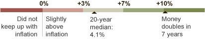
I thought folks here should be made aware of an interactive chart that a poster MossySF at Bogleheads has created. It stems from a chart in the NYTimes from a chart from Crestmont. The chart shows real-returns based on starting and ending years for stock/bond/cash/gold asset allocations that you specify.
Here's a link to the chart: Annualized Real Returns by Starting & Ending Year
And here's the Bogleheads' link to the discussion: Bogleheads :: View topic - Great Chart: S&P returns by in & out date
Another poster Lbill wrote:
Here's a link to the chart: Annualized Real Returns by Starting & Ending Year
And here's the Bogleheads' link to the discussion: Bogleheads :: View topic - Great Chart: S&P returns by in & out date
Another poster Lbill wrote:
An absolutely critical chart that should be included in every fund flyer alongside those mountain charts that show how incredibly rich you will become by investing in stocks. Your fate is determined by the short period you are actually in the market. But there's more: it will be determined by the even shorter period during which you have the most at stake - which for many of us is just the 10-15 years during which we are at the peak of our earning and contributing. The poor soul who turned 54 at the turn of century and was enjoying his highest level career position and job earnings is now 65, and hasn't gotten much reward from religiously socking away his 60-70% into stocks in his 401(k).
Last edited:
")