Lsbcal
Give me a museum and I'll fill it. (Picasso) Give me a forum ...
This is one nice way to view the US market: Morningstar has a "market barometer", not just daily but over periods up to 3 years. By moving your cursor over the little style box images, the scales change to the appropriate values, e.g. for 3 months the scales change to the appropriate one for 3 month returns of +-8%. Here is a little picture of what you see at Morningstar Stock, Mutual Fund, Bond, ETF Investment Research :

For 1 year we see that the market is pretty uniformily up although the midcaps and small caps are up more then the large caps. It would be nice to see this sort of picture for internationals. Maybe even for bonds.
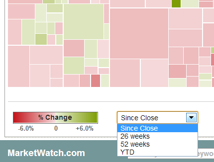
Anybody have other sources (hopefully visual/graphical) that they like for this sort of thing?
For 1 year we see that the market is pretty uniformily up although the midcaps and small caps are up more then the large caps. It would be nice to see this sort of picture for internationals. Maybe even for bonds.
Anybody have other sources (hopefully visual/graphical) that they like for this sort of thing?
")