What is Wrong with the Yahoo Charts?

TromboneAl

Give me a museum and I'll fill it. (Picasso) Give me a forum ...
Joined
Jun 30, 2006
Messages
12,880
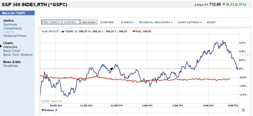
I like the Yahoo stock charts:

but lately they are just wrong. For example, this shows the S&P being up .1% when it's really up 2.08%. It's been like this for days -- am I reading it correctly??

BadChart.jpg
 
I read it the same way as you. I selected just about every chart option they offer to see if the problem involved one of their options, but they all show the same incorrect y axis when it's scaled to % (as it is when one does a comparison). The line graph is correct, but the % scale is wrong.
 
The problem appears to be with a bad data point for the previous close. Yesterday's close was 696.33, not 710.53.
 
Seems like they're using today's open, not yesterday's close. I noticed that yesterday. But today that's not quite right either, but closer to right than yesterday's close.
 
Oh, I got it now, they look into the future and use the closing value as the zero percent line. Good to know.
 

Attachments

  • ChartZeroAtClose.jpg
    ChartZeroAtClose.jpg
    68 KB · Views: 2
yahoo charts have been flaky for years. currently i can't get the new chart style in IE8, but works fine in Firefox and Safari 4.

i like to use stockcharts, but you have to pay to set up portfolios.
 
Back
Top Bottom