New Look for E-R.org

Andy R

Thinks s/he gets paid by the post
Site Team
Joined
Jan 31, 2007
Messages
1,220
Location
Dallas, Tx
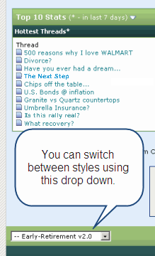
As I mentioned earlier E-R.org I have been working on a new look for our site. As you can see the switch has been made, hopefully you all like it. I'd suggest using the new look for a couple days to see if you like it. If you don't you can switch back to the old style in two clicks. Just go to the bottom left corner of the page and select Early Retirement v1.0 (see attachment).

Please post your feedback, broken links, or other issues to this thread so I can address them and get all the bugs worked out. Thanks for your patience during this transition.
 

Attachments

  • new PM.gif
    new PM.gif
    14.9 KB · Views: 302
Clicking on a thread in the Portal takes you to the top of the thread instead of where you left off reading the last time.:(
 
Having the list of threads centrally rather than left aligned is my reason for going back to the old version.

Instead of running your eye down a list, now you have extra work to do just to locate the start of each thread title.

Edit: I see this misalignment issue is everywhere, even fragments of paragraphs in posts are being centred. This can't be intentional. Is it just me? I'm using IE8.
 
Wasn't there a "More Statistics" link somewhere on the old homepage? I can't find it anywhere now.
 
Having the list of threads centrally rather than left aligned is my reason for going back to the old version.

Instead of running your eye down a list, now you have extra work to do just to locate the start of each thread title.

Edit: I see this misalignment issue is everywhere, even fragments of paragraphs in posts are being centred. This can't be intentional. Is it just me? I'm using IE8.
Seeing the same central alignment of post text and thread titles. Using IE 7 on Windows XP.
 
Clicking on a thread in the Portal takes you to the top of the thread instead of where you left off reading the last time.:(

This is a big problem IMO. I would prefer to use the new format, even though I like it less, because I want to see what my posts will look like to most others.

But if I need to make the extra effort to find where I left off in a thread, I'll just use the old format.

IMO, unless there is something I don't see yet, the new format is a step backward.

Ha
 
Please be patient - we are working to resolve these issues. Posting specific info about bugs however is very helpful. Tweaks are in progress.
 
Freebird, that feature has always been there...

Note: the auto update of the last 20 posts isn't working in the new version. Andy and Janet are all over it...
 
I like the new look personally.

One thing I noticed is that the star ratings under people's avatar has been replaced with those little "rep power" squares. I had no idea what "rep power" meant until I googled it. The star rating seemed to be tied solely to a poster's prolificacy, but "rep power" seems to be merit-based. So the question is, how is our "rep power" rating determined, and how can we influence another poster's "rep power"?
 
Freebird, that feature has always been there...

Note: the auto update of the last 20 posts isn't working in the new version. Andy and Janet are all over it...
I must have been asleep in the recliner again...;)

No criticism intended, I'm just poking at links and trying them out. :D
 
List of To Do Items (so far):
- Portal links going to first post not last read post
- Meet Our Team page not working
- Scrolling posts on the iSpy page not working
- Some text center aligned and not left aligned
- Advertising Link not working
- Remove Rep Power Squares (these were not being shown on the old skin and simply confuse people. We also do not use the rep power the way the software was built, we use the feature to power our Thanks system making the squares redundant (similar to the stars)

I will begin working on this momentarily and post back as I make progress.
 
I think I prefer left justified (vs center), but no big deal either way. I think the new look is great!
 
Hey Andy,

Old format is correct width on screen. New format is about 20% larger to the right. Any advice?

Tomcat98
 
So why is the 'Top' button hidden? It's there but the skin downplays it. I would prefer that it be boldfaced.


-- Rita
 
The old skin had a link for FIRECalc that showed up near "Contact Us" at the bottom of each page. I think we need that.

Coach
 
Here is an update:

Fixed:

  • Portal links going to first post not last read post
  • Some text center aligned and not left aligned
  • Remove Rep Power Squares (these were not being shown on the old skin and simply confuse people. We also do not use the rep power the way the software was built, we use the feature to power our Thanks system making the squares redundant (similar to the stars)
  • Link to FireCalc added back to footer (and made other links match as well)
Issues Remaining:

  • Scrolling posts on the iSpy page not working
  • Not fitting well on 800x600 screen resolution
  • Advertising Link not working
  • Meet Our Team page not working
  • Top Button needs to be bolder & easier to see (as well as other links in the same area)
I am also planning to give some feedback on other things such as making the portal page easier to read (lines to help each row on the recent threads be clearer) and a few other odds and ends. Some of this I am going to have to get help with so please be patient. We will get things dialed in over the next week or so.
 
Interesting, when I opened this from work I saw the new look (which I like!).

I come home and its still the old look in my Firefox. ANy idea why this might be? SOme cookie setting or caching of some sort?
 
Thanks RE, that did the trick.

Love the new look, guys. I'm sure any and all kinks will get worked out.

Thanks!
 
Back
Top Bottom