donheff
Give me a museum and I'll fill it. (Picasso) Give me a forum ...
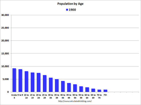
I like this animated population graph from Calculated Risk. It is interesting to watch the boomer pig in the pipe moving along as well as the general increases in life span. What I find most interesting is the relatively slight increase in the far right tail going out to 2060. Not too many of us can expect to hit 95 let alone 100.