Right Column

Andy R

Thinks s/he gets paid by the post
Site Team
Joined
Jan 31, 2007
Messages
1,220
Location
Dallas, Tx
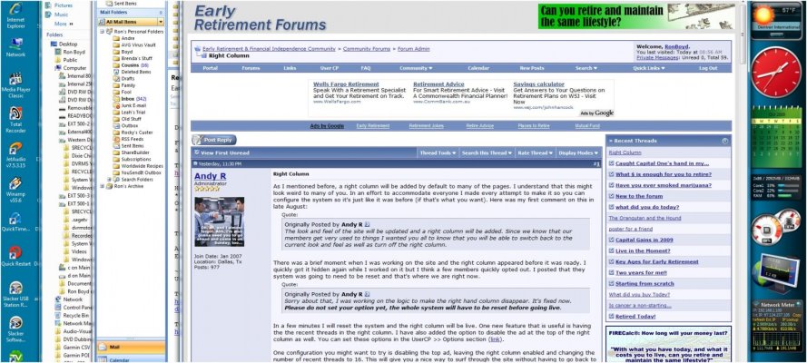
As I mentioned before, a right column will be added by default to many of the pages. I understand that this might look weird to many of you. In an effort to accommodate everyone I made every attempt to make it so you can configure the system so it's just like it was before (if that's what you want). Here was my first comment on this in late August:
The look and feel of the site will be updated and a right column will be added. Since we know that our members get very used to things I wanted you all to know that you will be able to switch back to the current look and feel as well as turn off the right column.
There was a brief moment when I was working on the site and the right column appeared before it was ready. I quickly got it hidden again while I worked on it but I think a few members quickly opted out. I posted that they system was going to need to be reset and that's where we are right now.
Sorry about that, I was working on the logic to make the right hand column disappear. It's fixed now. Please do not set your option yet, the whole system will have to be reset before going live.
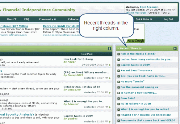
In a few minutes I will reset the system and the right column will be live. One new feature that is useful is having the the recent threads in the right column. I have also added the option to disable the ad at the top of the right column as well. You can set these options in the UserCP >> Options section (link).

One configuration you might want to try is disabling the top ad, leaving the right column enabled and changing the number of recent threads to 16. This will give you a nice way to surf through the site without having to go back to the portal page to see what's going on.

10-2-2009 2-25-54 AM.gif

I know the right column will feel awkward at first but if you give it a chance you might actually like it.

Thanks for your understanding and patience during this remodeling process.

Kind Regards,

Andy
 
Dunno what if anything i clicked, but that right column popped up for me and i got to spend 5 minutes clicking around trying to get rid of it. Did so and am much happier now. Am trying the minty fresh luck o' the Irish color scheme now though and find it lights up my desktop nicely. Thanks Andy! I also like it when stores move their product to new shelves so I can be introduced to different things I might want to buy rather than just going in and efficiently buying what I want. The older I get the more I depend on habit and well trod paths.
 
Just got the 'right column' and do not like it... it is much slower and does not 'flow' for me...

Found out about the option to go back and am now not cursing at the screen....

Now if I can find out how to block the ads at the top... all will be good...
 
I like it. My monitor is 21 inches wide and my browser window is about 15 inches, so I don't have any problem with reduced viewing area.

I just looked at it with my laptop which has a 14 1/2 inched screen with an 11 inch browser window -- still no problem. (I am closer to the monitor, though.) It does scrunch it a wee bit, however -- For instance, post #4 has three single lines with lots of space (2") on the right on the larger monitor while the laptop wraps three words in the first line.

I think it is a good trade-off to get "easier" (read "no effort") access to the "portal" listing. The "Quick Links" located on the right is also a nice touch.

Funny though, how the larger monitor has a blue color scheme and the laptop the green version when viewing the same page.
 
I'll try it for a while. It might help with one of my pet peeves: posts that are excessively long with no paragraph breaks. But I'm guessing, even with the nice book size area, I'll be lifting my eyes off of those posts a short why into those looooong paragraphs. :nonono:
 
Funny though, how the larger monitor has a blue color scheme and the laptop the green version when viewing the same page.
Ron, you can select green or blue versions by going to the drop-down menu at lower left of the page and choosing "--Early-Retirement v1.0" or "--Early-Retirement v2.0".
 
Ron, you can select green or blue versions by going to the drop-down menu at lower left of the page and choosing "--Early-Retirement v1.0" or "--Early-Retirement v2.0".

And that meta-data is kept in a cookie on each machine instead of in my Profile on the website? Hmmmm.

Actually, I prefer the blue screen. I believe that is a function of having blue eyes (At least, that is what I was told back in the days of monotone monitors -- amber was always more pleasant for me to look at.)
 
....
Actually, I prefer the blue screen. I believe that is a function of having blue eyes (At least, that is what I was told back in the days of monotone monitors -- amber was always more pleasant for me to look at.)
So far, I also prefer the blue, but am switching back and forth to give the green more time. Some of the large ads on the top of the screen have bright red wording which to my eyes is more jarring with the green version; complementary color effect?
 
Great new feature! Now how do I make it go away?
 
On my 10" netbook, the right column takes up around 30% of the screen width. Not a good feature for this type of computer.
 
On my 10" netbook, the right column takes up around 30% of the screen width. Not a good feature for this type of computer.

Members' different reactions demonstrate why it is so great that Andy has arranged for us to have a choice about it. :)
 
On my 10" netbook, the right column takes up around 30% of the screen width. Not a good feature for this type of computer.

Hmmmm. The right hand column takes up about 1/4 of the window on both (the above referenced) machines.

Here is a capture that shows how it fits horizontally on my desktop monitor:

Screen.jpg
 
Just got the 'right column' and do not like it... it is much slower and does not 'flow' for me...

Found out about the option to go back and am now not cursing at the screen....

Now if I can find out how to block the ads at the top... all will be good...

Firefox with adblocker plus as an add-on. No ads for me. :)
 
The is an option under "User CP", "Edit Options", to remove the ad at the top of the right hand column. It is just above the option of removing the right hand column entirely.
 
I got rid of the right column ad, set the numer of threads to 25, and it all looks great on a Dell Inspiron laptop (vintage 2005).
Setting the IE browser text size to Larger (pull down View,Text Size in IE menu) and setting the browser window to full screen makes the font size very readable for me.

I really like not having to go back to Portal all the time. :flowers:

Nice job. :D
 
I know it's weird to see the right column on the page after viewing a site for such a long time without it. I spend all day on forums and having the recent posts in the right column is very handy. Hopefully the flexibility of the setup will allow everyone to find set things up how they choose.
 
Well, I made the right column go away...

I've never used the recent posts feature; I like being able to reference earlier posts if need be. Old fogey!
 
Well, I made the right column go away...

I've never used the recent posts feature; I like being able to reference earlier posts if need be. Old fogey!

Yup.
 
Back
Top Bottom