Midpack
Give me a museum and I'll fill it. (Picasso) Give me a forum ...
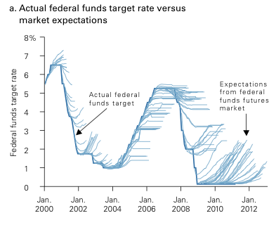
We've all seen these discussions [-]way too many[/-] several times, but I thought this chart from Vanguard might be illuminating. What it predicts is, we (including the pros) can't predict - way more often than not. Those who have been [-]screaming[/-] [-]begging everyone[/-] suggesting we should all get out of bonds for the past 3+ years are conspicuous on the chart. Not that "they" won't be right eventually of course, they will indeed. But it's nice to have the yields in the meantime without the volatility of riskier asset classes.
As always...YMMV
As always...YMMV
from Bogleheads said:The thin lines are the market's interest rate predictions--not one guru's vision, the wisdom-of-the-crowds prediction. The thick lines are what actually happened. Notice the utter failure to be even approximately right even as little as one year ahead. People have trouble understanding this chart, and I think the reason is that they can't actually believe what they're seeing. Thin little hairs? Prediction. Thick line? Fact. Any place it looks bushy, the predictions were badly wrong. It looks bushy everywhere.
Attachments
Last edited:


 Good thing I'm not into this stuff with my own money... so far, over the past 15 years, I've been correct in predicting what will happen... Problem is, the actual changes have trailed the predictions by about 2 years.