mickeyd
Give me a museum and I'll fill it. (Picasso) Give me a forum ...
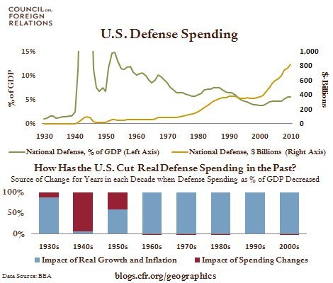
You may have to study this for a bit to get the idea that defense spending is way down and medicare is way, way up. Pretty interesting look at how we spent and spend our government cash over the last 50 years.
50 Years of Government Spending, In 1 Graph : Planet Money : NPROf each dollar the federal government spends, how much goes to defense? How much goes to Social Security? How much goes to interest on the debt? And how has this sort of thing changed over time?
The graphic below answers these questions. It shows the major components of federal spending 50 years ago, 25 years ago, and last year.