Returns are almost never average

USGrant1962

Thinks s/he gets paid by the post
Joined
Dec 15, 2016
Messages
2,503
Location
DC area
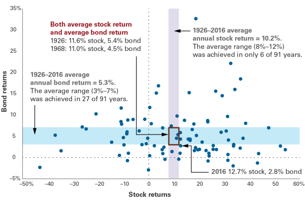
From the Vanguard blog, a really interesting graph of bond against stock returns per year.

https://vanguardretailblog.files.wo...nnyhoff_required-v-desired-returns_final1.png

Lots of interesting observations here. For example, bonds have never lost more than about 4% in a year. There were a couple of years when bonds gained over 20%, and as the headline pointed out - average returns are unusual.

Here's the full blog post: https://vanguardblog.com/2017/11/16/whats-your-benchmark-for-investment-success/
 

Attachments

  • bennyhoff_required-v-desired-returns_final1.png
    bennyhoff_required-v-desired-returns_final1.png
    63 KB · Views: 66
Neat chart!

I am not sure this statement is true... It depends on what type of bonds you have.

Good point. But it also illustrates a key principle - high quality bonds are important. They used AGG - Bloomberg Barclays U.S. Aggregate Bond Index from 1976 to 2009. Not sure why they switched to a floating bond index thereafter.

If you take on riskier bonds you won't get as much downside protection. I prefer to hold higher quality bonds overall and use equity gains to grow the bond pile via rebalancing rather than riskier bonds that throw off higher dividends.

Notes: Represents each calendar year from 1926 to 2016 (91 points = 91 years) plotted at the intersection of that year’s stock return and that year’s bond return. The vertical shaded area contains all years whose stock return was between 8% and 12%. The horizontal shaded area contains all years whose bond return was between 3% and 7%. Stock returns are represented by the Standard & Poor’s 90 Index from 1926 through March 3, 1957; the S&P 500 Index from March 4, 1957, through 1974; the Dow Jones Wilshire 5000 Index from 1975 through April 22, 2005; the MSCI US Broad Market Index from April 23, 2005, through June 2, 2013; and the CRSP US Total Market Index thereafter. Bond returns are represented by the S&P High Grade Corporate Index from 1926 to 1968, the Citigroup High Grade Index from 1969 to 1972, the Lehman Brothers U.S. Long Credit AA Index from 1973 to 1975, the Bloomberg Barclays U.S. Aggregate Bond Index from 1976 to 2009, and the Bloomberg Barclays U.S. Aggregate Float Adjusted Index thereafter.
 
Very good chart. Market return bounces all over the place. Euphoria one year, despair the next. Greed then fear.

One should be able to find a way to make money off this (and there is). :)
 
Can we get the same chart in real returns, especially for bond returns that's relevant.
 
Neat chart!


Good point. But it also illustrates a key principle - high quality bonds are important. They used AGG - Bloomberg Barclays U.S. Aggregate Bond Index from 1976 to 2009. Not sure why they switched to a floating bond index thereafter.

If you take on riskier bonds you won't get as much downside protection. I prefer to hold higher quality bonds overall and use equity gains to grow the bond pile via rebalancing rather than riskier bonds that throw off higher dividends.

we are kind of doing a "risk barbell) now with bonds .

i swapped my short term bond fund for an ultra conservative bond fund with very little interest rate and credit risk .

at the same time i reduced my total bond fund by 1/3 and added to my go anywhere bond fund which holds higher risk stuff but less interest rate sensitive stuff like foreign ,some high yield and emerging market type bonds as well as high grade corporate and some gov't ..

overall it reduced the interest rate sensitivity which is the biggest risk today while producing higher interest overall than the prior combo .

bonds have different risks at different times . today it is not credit risk that is the biggest concern , it is interest rate risk .

if we have a downturn and stocks take a hit treasury bonds would be the best place to be , but with corporate profits running the highest ever and balance sheets around the world improving , interest rate risk to bonds is likely the biggest risk not credit at this stage .
 
Last edited:
Interesting chart. Seen it often for stocks, but not for bonds, or both.

One thing it doesn't show is that, to save your butt in a stock sell-off, there is NO substitute for treasury bonds.
 
specifically long term treasury bonds or you need about 3x the dollars in bonds to actually provide enough lift to stocks in a down stock market if neutralizing the drop is the intention .
 
Last edited:
Back
Top Bottom