Midpack
Give me a museum and I'll fill it. (Picasso) Give me a forum ...
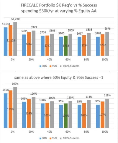
As a corollary to the earlier Portfolio vs AA thread (link below), though this topic hasn't come up in a while. Again, the exact $ are not the central point, the graphs are meant to compare the relative portfolio required to spend $30K/yr (inflation adjusted) over a 30 year retirement at 90%, 95% and 100% success at various asset allocations. Once again, I used FIRECALC to generate all the numbers. The vertical axis is portfolio value, the horiz axis is % equity and the colored bars are success rates.
If the second chart seems confusing, it's was meant to more clearly show how much more or less you would need to retire at various success rates and asset allocations as compared to a 60:40 AA and a 95% success rate (often the baseline for SWR discussions). For example, if you want to retire with a 100% success rate and % equity - history suggests you'd need 167%, or 67% more than another retiree with a 60:40 AA and 95% success rate. That's a LOT more years working to retire, or dramatically less spending in retirement. We all have to assume some risk, it's just deciding what trade off between risk and when to retire (or how much to spend) we can live with.
Again, I leave it to readers to draw their own conclusions (instead of blathering on further myself).
[For you eagle eyes who note the $ results are slightly different than the earlier thread, it's because the first thread I used the default long interest rate for fixed income, and in this one I used 5 year treasuries at the suggestion of a member on the earlier thread.]
What's different in the charts on both threads is success rates are given, whereas more often charts use portfolio $ as a given. That's why they may seem a little counter intuitive.
http://www.early-retirement.org/forums/f28/portfolio-required-v-equity-asset-allocation-101660.html
Attachments
Last edited:
")