Return on S&P500 = 90 day treasuries since 1999

soupcxan

Thinks s/he gets paid by the post
Joined
Aug 25, 2004
Messages
1,448
Location
Houston
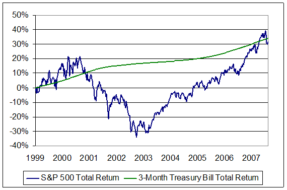
I spotted this chart on another forum...is anyone else concerned when stock returns appear to be doing well year-to-year, yet over the medium term they've been mostly flat versus a "risk-free" bond. Then when you take out inflation (+3%/year), taxes (~2%/year), and the decline in the value of the dollar (depends on which foreign currency you benchmark but it's substantial, as anyone who's been to Europe lately knows) and you've actually lost purchasing power over the last 8 years.

Obviously, this chart was put together by a perma-bear, he selected a particular time scale to make his point...but even so, I think it's easy to be fooled by reporting a 10% "average annual return" on your investments but in reality your true return is much less. The author also ignores the benefits from a more diversified portfolio over this time period - but when I look at returns YTD 2007, there seems to be a lot of correlation between large cap, small cap, and international stocks, particularly on the market's bad days, so I'm not sure diversification is enough to save us all.

Of course, I don't know what other investment options there are that
would have a better chance of generating real returns...

wmc070827c.gif
 
What exactly is your point here ?

Is it that there are select periods when being in bonds or T-bills will outperform the market ?

Should that be a surprise to anyone ?

I would note that this chart includes a very rough patch for stocks after the tech bubble burst.

Just look at a 10-year S&P500 chart to let you know that the S&P500 is just now breaking/approaching its peak from 2000.

Lets do the same comparison over the last 20 years and over the last 30 years and over the last 5 years. That should be enlightening.
 
Last edited:
That 3 Month Treasury Bill Total Return line looks fake to me, and there is no source cited for the data presented. Blech.

2Cor521
 
Maybe I can dig up another chart that is more accurate.......
 
That 3 Month Treasury Bill Total Return line looks fake to me, and there is no source cited for the data presented. Blech.

Back of the envelope says it looks OK to me. 4% yield over an 8 year period gives you a 37% gain.
 
Back of the envelope says it looks OK to me. 4% yield over an 8 year period gives you a 37% gain.

I think the graph looks like that because of the 8 year period that was selected, and it might look different if it was graphed over 15-20 years.
 
I think the graph looks like that because of the 8 year period that was selected, and it might look different if it was graphed over 15-20 years.

Of course. I think the point of the graph is that expected future returns on stocks are low during times of crazy valuations, and that's exactly what we got -- low returns after crazy valuations.
 
or move the starting point of that 8 year period back a year or two and you could double your cumulative return.

Bottom line - data mining can produce beautiful gems to support whatever point you want to make.
 
Factor in taxes, and the SP would still be a winner.
 
Actually, The pic reminded me how much better off you'd be as a DCA-er during such a period.
 
I checked the chart against the returns of VFINX and Prime MM over 1999-YTD. Prime MM and VFINX had same returns, which were minimal in real terms.

Of course, same thing happened from 1968-1982, both TSM and Tbills had same real return [according to Ken French's data library + Bureau of Labor Stats site]. Guess what happened, post 1982? :cool:

btw - Coffee House portfolio, Wellesly, Wellington, and similar Life Strategy fund all beat VFINX and Prime MM from 1999-ytd.
 
btw - Coffee House portfolio, Wellesly, Wellington, and similar Life Strategy fund all beat VFINX and Prime MM from 1999-ytd.

Yep - the guy making this graph had the benefit of hindsight to pick just about the worst performing major index over just about the worst time frame (he could have started a year or so later to make returns seem even worse).
 
Hey, he could have picked NASDAQ. The S&P500 is the standard proxy for the market. BTW, bonds did pretty well during that period as well (thanks to declining interest rates).
 
BTW, I just realized that the chart came from Hussman.

http://hussmanfunds.com/wmc/wmc070827.htm

This guy is a pretty rigorous economist who also happens to believe that we're currently in a period of high valuations (masked by extremely high recent earnings), and that future returns won't be much better than t-bills for a while....
 
Well, it just goes to show, we should have cashed out our equities in 2000 and bought treasuries. Then in 2003 we should have gotten back into equities. Duh, what were we thinking? I wish someone would have shown me this chart back in 2000.
 
Yeah, if you read the article, that's essentially what he's telling you now.
 
Of course, I don't know what other investment options there are that would have a better chance of generating real returns...

wmc070827c.gif


TIPS were raging bargains at the time, and not just prospectively.

Ha
 
Last edited:
And what's the raging bargain today, pray tell?

I heard a bond trader espouse the other day on what a great value high-grade corporate bonds were these days. Their yield has gone up about a percent or so since the recent turmoil.

Same bat station, more bat yield. What's not to like ? Is the buy now signal flashing ?... You be the judge.

iamthenight-Batman-Bat-Signal-CEL.jpg
 
The spread looks pretty good. Not sure I'd call it a bargain, but something to consider.

spreadpaper.jpg
 
And what's the raging bargain today, pray tell?

Sarcasm will get you nowhere amigo. If a real 4% on a US treasury security would only appear to be a bargain in hindsight nothing can be done for you. ;)
 
Sarcasm will get you nowhere amigo. If a real 4% on a US treasury security would only appear to be a bargain in hindsight nothing can be done for you. ;)

No sarcasm. Even with the "correction," I'm not seeing any raging bargains today. TIPS at 2.4% aren't a bargain. The S&P 500 with a 1.7% yield probably isn't a bargain (unless recent earnings growth can be sustained).

Junk yields are starting to look OK, but junk can get much junkier in a downturn.

Brewer thinks banks are a bargain, but I think earnings may be at risk. Shipping does look pretty good in the near term though. (Bought DRYS at 61.30 yesterday. Pray for me.)
 
Back
Top Bottom