This chart scares me.

Yeah, and a little better hint in the thread title is nice too.
 
If I read it well, it basically says that with increasing passively managed money market volatility will go up, as well as the correlation between funds.

I think the last one is correct, not sure about the first one.

Also think however that we are a long way from big effects since most actively managed funds behave more like passively managed funds anyway (index huggers). So all one does is remove management fees from the equation and be more upfront about expectations. If anything, this might decrease volatility (fewer people run in a downturn if they expect one to happen).

Unless you are scared by the huge overall inflows in the stock exchange?

Yeah, it will lead to a correction. That's the game, was bound to happen. This year looks like it will shape up to be flat in USD, so no big thunderstorm yet. It will come though, inevitably.
 
I have no idea what the author point even is, maybe I'm stupid.
The chart from M* shows ~150 billion in inflows to passive managed stock and bond funds for the entire US fund industry, that fact matches what ICI claims. This isn't just Vanguard funds it's all fund companies. In 2000 there were 271 index funds in the US. In 2013 that number is 372(according to ICI). Are these all Vanguard funds, no, I have no idea what point the author is making. He seems to believe Vanguard is the only provider of index funds. Since he's misinterpreted the data from the start, I can't understand his point, if he even has one.
 
"This chart scares me."

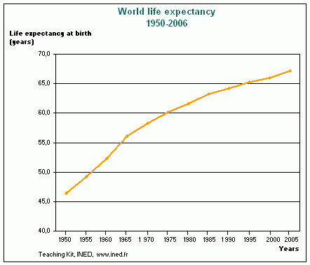
Pffffttt. Now here's a scary chart:
 

Attachments

  • Life expectancy.JPG
    Life expectancy.JPG
    70.9 KB · Views: 190
"This chart scares me."

Pffffttt. Now here's a scary chart:


Looks like a fun slide down. What happens when you get to the bottom though?

Wheeeee!
 
"This chart scares me."

Pffffttt. Now here's a scary chart:
attachment.php


If I were to believe this chart, :( I should significantly increase my spend rate since I can't take it with me.
 
um, yeah guys that's how it works - looks like it's from an old mortality table tho
 
....snip....

Unless you are scared by the huge overall inflows in the stock exchange?

Yeah, it will lead to a correction. That's the game, was bound to happen. This year looks like it will shape up to be flat in USD, so no big thunderstorm yet. It will come though, inevitably.

Thanks, if that's his point he sure took the back road to make it.

So there's gonna be a correction. Wow who woulda thunk that.
 
I'm not sure why one person's thoughts should be scary. Remember that the market is going to crash anyway as all we retiring baby boomers sell our stocks to get cash. DOWN, DOWN, DOWN... Guaranteed, right?

As far as thread titles go, I tend to avoid threads with titles such as "Help me with this!", "I would have never guessed" and "What happens now?". Specifics in the title and initial message usually will get more and better responses, IMHO. To each his own.
 
If I read it well, it basically says that with increasing passively managed money market volatility will go up, as well as the correlation between funds.

But most people will still underperform market because they will jump from index to index.
 
"This chart scares me."

Pffffttt. Now here's a scary chart:

Me too, and if we get a few more years like 2008 along the way, a significant deflection could impact the curve even more to one's longevity, especially since family long life genes will no longer help you.
 
Back
Top Bottom