Decades chart, roaring 20's ?

Lsbcal

Give me a museum and I'll fill it. (Picasso) Give me a forum ...
Joined
May 28, 2006
Messages
8,809
Location
west coast, hi there!
I've updated my decades chart to add the current one, the 2020's. Hoping for a repeat of some past great decades. :)

The thick blue line is the current 2020's through April 2021. There are 10 other completed decades on this chart. I showed decades so that one could see how variable they have been and many of us think in terms of decades. Note this is inflation corrected data. Semilog charts help to show growth rates. A 7% growth rate is shown as a reference only. The solid think purple line is the 2010's that we have recently experienced.
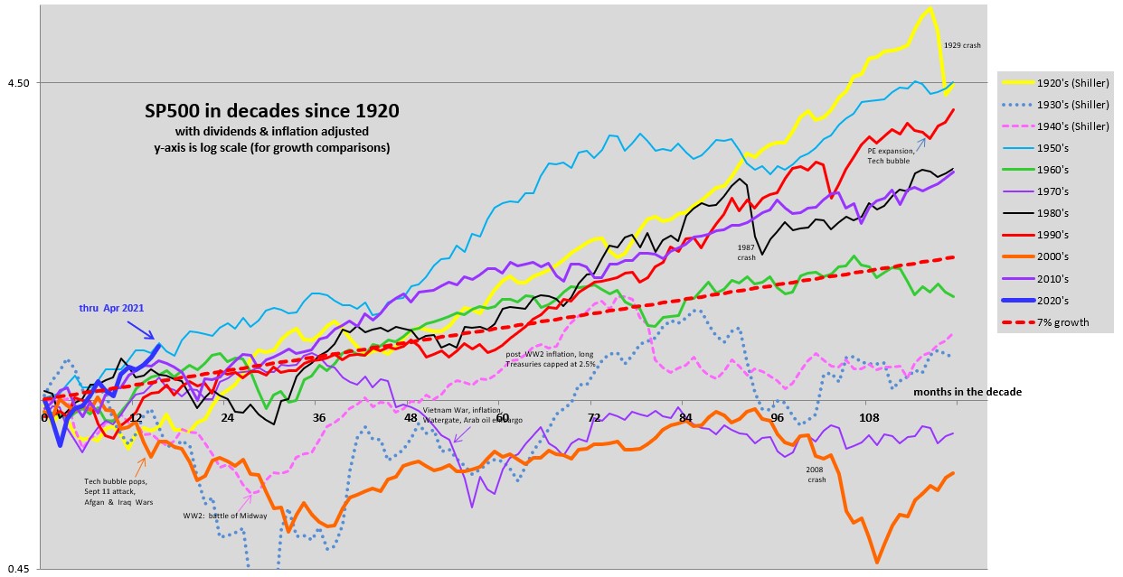

image1.jpg


If the current market just followed a 7% rate from here it would be lower then some past decades but I would be a happy camper. I love things that go up and to the right. :dance:
 
So the last two decades were the worst, yet it doesn’t seem that bad?

Thanks for maintaining the chart. I always enjoy seeing how we’re trending.
 
I expressed the opinion here sometime ago that they clearest comparison to our current situation economically was the early 1920s. The post-Korean war era is another possible model for similar reasons.
 
Very cool. Not sure what practical value it has for investing decision making but it is nevertheless one of the "type" of things I like to look at from time to time in order to reinforce my belief in "buy and hold"

Thanks for posting.
 
I always enjoy these charts. Thanks for posting them.
 
So the last two decades were the worst, yet it doesn’t seem that bad?

Thanks for maintaining the chart. I always enjoy seeing how we’re trending.

In looking at the chart, I think the purple line above the 7% represents the 2010 decade. The 2 worse years are 1970 [purple] line below the 7% trend line and the 2000's.
 
Very cool. Not sure what practical value it has for investing decision making but it is nevertheless one of the "type" of things I like to look at from time to time in order to reinforce my belief in "buy and hold"

Thanks for posting.

I think the practical value might be:
1) It doesn't look like current the price action is all that unusual historically.
2) It is easier to see how various historical events played out in the market (for large caps at least)
3) It is a pretty graph with lots of color.
 
In looking at the chart, I think the purple line above the 7% represents the 2010 decade. The 2 worse years are 1970 [purple] line below the 7% trend line and the 2000's.

Right, the 2010's are a thicker purple line then the 1970's.
 
So....cut the red wire:confused:

Maybe if you mean the 7% growth line. The growth rate of the SP500 is clearly variable.

I think the approximate long term return for the SP500 is 10% before inflation. If the average inflation is 3% over the decades, then we get 7%.
 
In looking at the chart, I think the purple line above the 7% represents the 2010 decade. The 2 worse years are 1970 [purple] line below the 7% trend line and the 2000's.


You’re right. I got my purples mixed up. That makes a lot more sense. The 2010 decade was pretty good.
 
So the last two decades were the worst, yet it doesn’t seem that bad?

Thanks for maintaining the chart. I always enjoy seeing how we’re trending.
It is surprising to wake up, see we just had 2 of the worst decades of the last ten, and be ok with it. I suppose if the 2020's turn out to be negative, that would trigger a lot of angst.
 
I wouldn't make a prediction from it. For entertainment purposes only.
 
It is surprising to wake up, see we just had 2 of the worst decades of the last ten, and be ok with it. I suppose if the 2020's turn out to be negative, that would trigger a lot of angst.

No, the 2010 decade wasn’t one of the worst. It’s got to be one of the best - yeah, in the top 5 best.

People are confusing the 1970 line with the 2010 line.
 
Lsbcal, love your charts !!!

Excluding data for 1920s-30s-40s - a lot of special cause variation that is not currently applicable IMHO, here is what I see:
1950s - Good :D
1960s - Good :D
1970s - Bad :mad:
1980s - Good :D
1990s - Good :D
2000s - Bad :mad:
2010s - Good :D
2020s - :confused:
2030s - :confused:

predictions? :cool:
 
Last edited:
Lsbcal, love your charts !!!

Excluding data for 1920s-30s-40s - a lot of special cause variation that is not currently applicable IMHO, here is what I see:
1950s - Good :D
1960s - Good :D
1970s - Bad :mad:
1980s - Good :D
1990s - Good :D
2000s - Bad :mad:
2010s - Good :D
2020s - :confused:
2030s - :confused:

predictions? :cool:

I use to have a smiley face on the chart with the warning that this is not predictive. But I sure wish it were.
 
hmm, so how do I plan to retire at the start of a frowny face?
Someone please let me know when to cash in my '20s gains so I can thrive till the '30s
:)
 
Back
Top Bottom