How does this decline compare to previous recessionary ones?

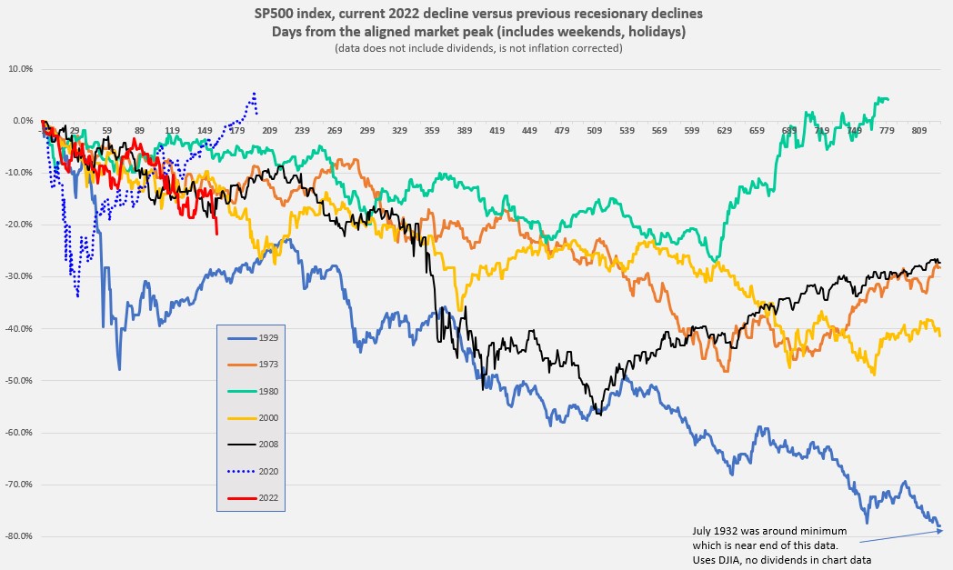
The numbers in my chart for the 1930's extend from September 1929 to July 1932. So yes, there was deflation for sure and maybe something like 20%. So maybe the market was down "only" 50% by July 1932 (bottom of the decline) when one considers deflation and dividends.

Still the message in this chart is primarily how long it takes to decline and how variable the decline would be. Plenty of sleepless nights if you were not set in your risk tolerance. And in the 1930's you'd be seeing a lot of unemployment (maybe even your job) and scary headlines. In today's hyper news environment it could be quite disturbing.


Okie granddad (Southern Oklahoma) told me that a)few people had jobs, b) the Dustbowl meant that the self-employed farmers didn't have income, c) prices went down but no-one had any cash money. He, grandma and my 3 year old dad lived in a converted chicken coop for a couple years before he worked for the CCC and felt fairly lucky they weren't starving.
 
I’m always impressed with your macro charts. I just don’t know how to place this swoon in the context of a very long bull market interrupted by a sudden global pandemic with record high unemployment, addressed by unprecedented money printing, QE and wage supports, much of which immediately inflated investable asset prices and resulted in record low unemployment, with high commodity prices in part due to a major recovery, a lingering trade war and a shooting war in commodity-rich parts of Europe, all touching off an inflation spike, heading us toward rapid Federal Reserve quantitative and rate tightening.

Got anything like that? [emoji43]*[emoji94]

+1
And add to that a China that (IMHO) is intent on taking Taiwan one way or another. That's going to be the killer (IMHO).
 
I wouldn't worry about if we're technically in a recession or not. We could have unknowingly already been in one! There have been times that we didn't know we were even in a recession until after it was over. The final numbers keep getting revised over time.
The technical definition of a recession is two straight quarters of negative GDP growth. We’ve already clocked one. Now the fed is raising rates and we’ve had 4 straight months of negative growth in new home sales. There’s also evidence of price cutting in some housing market areas. The downstream impacts of fewer new houses in durable goods is fairly dramatic if it lasts a long time. We’ll know when “ long time is” when people stop talking about supply chain issues and start talking about a ncreasing inventories.

My crystal ball says we’re currently in recession and we’ll find that out in July. I don’t see any way that doesn’t continue through the 3rd quarter at a minimum and in all likelihood through the end of the year as the housing market and affiliated markets unwind. The argument that the housing market is supported by demand and we’ll secured unlike 2008 is static analysis in my view. It doesn’t take into account what happens to the market in an era of 1/2 point interest rate hikes. How many $850k loans are you going to sell at 5 - 6% interest as opposed to 2.5%?

Big tech is under assault from all sides in Europe and in the US. Privacy laws are being generated by states one after another complicating some of the largest player’s revenue models. Supply chain issues are hammer them from the other side. So, it seems unlikely that tech will ride to the rescue in the short to medium term. I’d guess we have at least 18 months to go on the recession.
 
+1
And add to that a China that (IMHO) is intent on taking Taiwan one way or another. That's going to be the killer (IMHO).
If that happened it would be worse than China taking Saudi Arabia. Why? 72% of global semiconductors are produced there. In one swoop, China would corner the market on semiconductors. Or destroy it. It takes 3 years to build a plant capable of making state of the art semis. Not to mention tools from around the world at a cost of $10s of billions of dollars. Unless we start building at home now, we’ll have to go to a full fledged war with China over it..
 
Sometimes when the market/stock is red is a good time to buy. ;)

DCA!![/QUOTE

This ^

I’m buying about $20k /mo or so.

I pushed back my FIRE a couple years. I could still make it work for next year but with such a huge buying opportunity in front of me, the delta is too great to ignore.
 
Of course, there have been and will be bear market rallies. Looking at your chart, I am just hoping we will have something like the green line or better, and not something worse.

And while we cannot predict the future, seeing historical data is good for me to put things in perspective.

And yes, I like to see the chart updated as things unfold.

Yeah, I'd like to see something like the green line, too, or better. Let's see. It was 1980. Paul Volker was on board as Fed Chairman where he soon raised the Fed rate significantly as part of the plan to address inflation. Bond rates followed. The past never repeats exactly, but....

Cheers
Big-Papa
 
^^^^^ “Sell down to the sleeping point.” - J.P. Morgan

This is why I paid off my house after the big crash woke me up and I stared down the risk of long term unemployment that could cost us the house.

Once I knew that my family would always have a roof over their heads, everything else was secondary. Our country doesn't let people starve and if it was so bad that the government was en masse kicking people out of houses for not paying taxes there wasn't much I could do about that anyways.

Mathematically paying the house off was a bad decision -- I'd have more money now if I hadn't done that -- but it sure let me sleep better.
 
You need time

Check out the table. All you need to do is wait. There ARE times when it will be a long wait!!! Yearly Total Return and Downturn for the S&P 500.png
 
"How does this decline compare"
Looking at the past 10 year's of gains, the decline could be in its infancy.
But, if you were in the market, you got huge gains during that period.

So far its nothing like 2000 or 2008. For that it would need to drop another 40% or so.
 
So far compared to 1974, this decline is the difference between a predatory Bear ripping off large chunks of your thighs and calves, and your neighbor's yappy little dog biting your ankle, drawing some blood and forcing you get get a few stitches at the local Emergency Care clinic.

IIRC, the market was down about 50% then, and Business Week magazine famously ran a front page story The Death of Equities.

https://ritholtz.com/2019/08/death-of-equities-40th-anniversary/
40 years ago today, the most infamous edition of BusinessWeek was published. “Death of Equities” it declared, with a subhead read, “How inflation is destroying the stock market.”
 
Last edited:
Will be even with the great recession when the S&P 500 hits 2602. Or down 46% from Dec. 2021 high.
I don't look for it to do that. But that is a direct comparison.
 
Last edited:
Yes the chart I posted did not include dividends as noted on the title. You can certainly add a few percent to those curves.

But the intention of the chart was not to show when you would break even. Rather the intention was to show how bear markets evolve over just 2 years or so. For me, it is to remind myself that what happens in a few weeks or even a few months is not necessarily the trend.

Can you (or someone else) extend the chart to show when people did break even in those scenarios? IIRC, sometimes the rebound was explosive, and sometimes not.
 
Past declines were viewed as obstacles to overcome. This one is viewed as part of a necessary transition. I expect this decline to last longer than most, because there isn’t an effort to stop it.
 
So far compared to 1974, this decline is the difference between a predatory Bear ripping off large chunks of your thighs and calves, and your neighbor's yappy little dog biting your ankle, drawing some blood and forcing you get get a few stitches at the local Emergency Care clinic.

IIRC, the market was down about 50% then, and Business Week magazine famously ran a front page story The Death of Equities.

https://ritholtz.com/2019/08/death-of-equities-40th-anniversary/

The funny thing is I remember that cover, and I read the article all those years ago. I was employed in my first job out of college, and putting as much $ as i could into the market. Meanwhile, all my coworkers were crowing about how much they were earning on CD's.

ETA: Man, I wish I would have kept some of those early investments FOR-EVER. Warner Lambert (acquired by Pfizer), and my biggest sell mistake EVER: I owned Stryker (a couple/few months after its IPO I bought 200 shares, that $3000 investment would be 7.7 million $ plus $90K+ in dividends PER YEAR (currently). OUCH.
 
Last edited:
So far compared to 1974, this decline is the difference between a predatory Bear ripping off large chunks of your thighs and calves, and your neighbor's yappy little dog biting your ankle, drawing some blood and forcing you get get a few stitches at the local Emergency Care clinic.

IIRC, the market was down about 50% then, and Business Week magazine famously ran a front page story The Death of Equities.

https://ritholtz.com/2019/08/death-of-equities-40th-anniversary/

Heh, heh, equities are still here and Business Week got sold for $1 (less than the cover price of one copy of their rag.)
 
UPDATE: Since the SP500 has dipped below -20% from the high, I brought this chart up to date as of the June 13th close.


image3.jpg
 
Our current situation reminds me of the late 70's and early 80's where we had a Bear market, high inflation, and rising oil prices. We also had interest rate increases that more closely matched the inflation rates, something we don't have today. The Fed may change the interest rate situation. We'll see.

In real terms 70's-80's market took over a decade to break even in real terms. Hang on.
 
Not easy to put a chart into contest, as the run up from say 2016-2022 in unprecedented.
Maybe overlay a longer term chart? Say 10 years? Rather than just from the high. For a better idea.
 
Back
Top Bottom