Lsbcal
Give me a museum and I'll fill it. (Picasso) Give me a forum ...
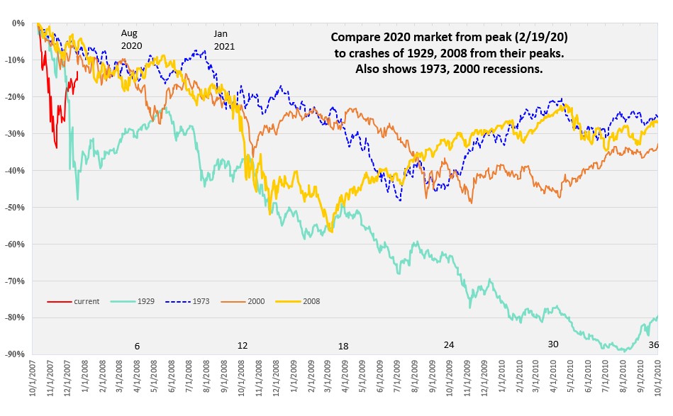
Here is an updated chart showing this decline compared to some past crashes and recessions. Sudden crashes occurred in 1929 and 2008. The 1973-74 recession did not really have a sudden "crash".
Each decline starts from its peak and the peaks are aligned. The X-axis dates are for the 2007-2009 period. The data is index data which does not include dividends. So the 1929 decline (DJIA data) was somewhat less because of the 4% to 7% dividends of those times.
I will try to update this periodically. Naturally we are all wondering where that red line goes next.
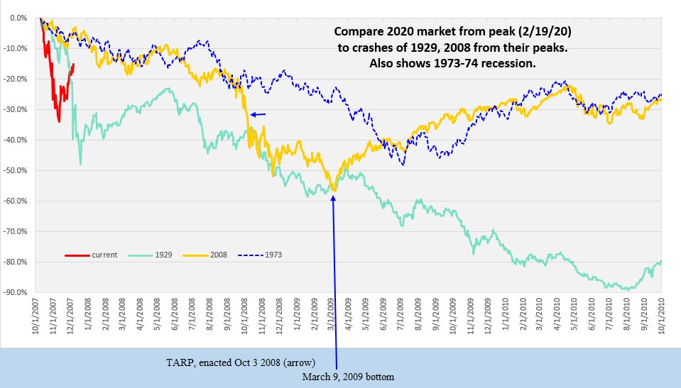
Note: This chart also appears in the other thread I started which initially focused on the 1987 crash comparison. But now that we are clearly in a recession, I decided to scope out to show the bottoms of each of these recessionary declines. I also removed the 1987 data since there was no recession in that decline.
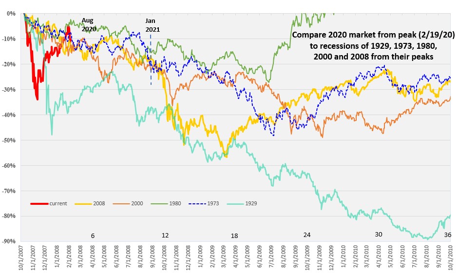
Each decline starts from its peak and the peaks are aligned. The X-axis dates are for the 2007-2009 period. The data is index data which does not include dividends. So the 1929 decline (DJIA data) was somewhat less because of the 4% to 7% dividends of those times.
I will try to update this periodically. Naturally we are all wondering where that red line goes next.
Note: This chart also appears in the other thread I started which initially focused on the 1987 crash comparison. But now that we are clearly in a recession, I decided to scope out to show the bottoms of each of these recessionary declines. I also removed the 1987 data since there was no recession in that decline.
Last edited: