I read somewhere that Friday was the nine year mark for this current bull market. Not sure if that is true. I've only been invested since 2007 (when I had access to very first 401k). I remember when I found this group back then, someone had suggested I move my money into some bonds.
Back then I didn't even know what a bond was then but I did. I think it was in 2008 that I went to a stock index fund.
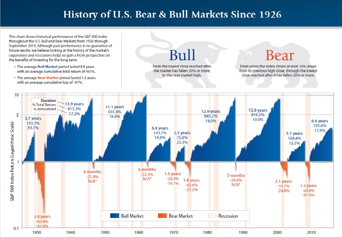
Strange I've really only known a bull market this far into my investing career, but I did see the impact of 2000, 2006/2007 and know that history does repeat itself eventually.
Not sure how long the other "long" bull runs lasted but it would be neat to see.
I hope it keeps going to 11,12, or 14 year run. I still have 13yrs before SofR is an issue, Hopefully the matador doesn't put this guy to sleep before then. I don't want a 13 yr bull, I don't like the # 13 lol
Back then I didn't even know what a bond was then but I did. I think it was in 2008 that I went to a stock index fund.
Strange I've really only known a bull market this far into my investing career, but I did see the impact of 2000, 2006/2007 and know that history does repeat itself eventually.
Not sure how long the other "long" bull runs lasted but it would be neat to see.
I hope it keeps going to 11,12, or 14 year run. I still have 13yrs before SofR is an issue,
Hopefully the matador doesn't put this guy to sleep before then. I don't want a 13 yr bull, I don't like the # 13 lol