Vanguard's New Look

Ah..maybe I'm not going color blind after all :).

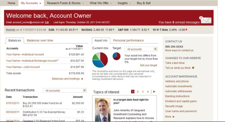
The lack of contrast is what I don't like the most. Too much tan, and grey. Even the text color is tan/brown instead of black. I know, it's Vanguard colors, but a bit stressful on the eyes, IMO.


Putting more functionality vs serveral clicks is a fair change (though I prefer the simplicity).
 
Last edited:
:confused:
Nope, still nothing. Almost starting to wonder, why are others getting shiny and new? I like new. Maybe my portfolio not good enough for them? Hello Vanguard :greetings10: did you forget me? Low fees is not ENOUGH! Free trades is not enough! Maybe I'll go talk to Fidelity. I WANT ATTENTION! I WANT TO BE SPECIAL! I WANT THE NEW COLORS!
 
My wife's Vanguard account has the new look. Mine does not and I even have about 10x the money in my account compared to hers.
 
My wife's Vanguard account has the new look. Mine does not and I even have about 10x the money in my account compared to hers.

Same here Ms G's sign on (yes I have agent authorization) is new, I got the old site.:facepalm:
 
What the heck is Vanguarding? Yes, yes, I know, but this kind of cutesy branding annoys the begorra out of me.

I just want low cost passive index funds and an easy to navigate site - oh, and the ability to go long on individual stocks (nothing fancy). Vanguard has all of this. I don't need the cute positioning statements.

Vanguarding my foot :yuk:

I look at it this way - the more folks they talk into Vanguarding, the lower my ER will be (eventually).

I haven't noticed anything different on the website either.
 
Does anybody have a shot of what the 'new' site looks like:confused:
 
Here is a shot.
 

Attachments

  • new web.JPG
    new web.JPG
    141.3 KB · Views: 46
I just logged in. My front page does NOT look like that.

I wonder if perhaps they are implementing the changes in stages so not all shareholders are affected yet.
 
Last edited:
I just logged in. My front page does NOT look like that.

I wonder if perhaps they are implementing the changes in stages so not all shareholders are affected yet.
+1
I see it does not say: VOYAGER Services. That's where we are at.
 
Ms G and I are Flagship, so I don't think that is the difference.
 
Wow, I did not realize that Vanguard had different screens for different folks as it were... I've had the same screens for years. I now wonder is it the amount of money, the number of years in the relationship or some other mysterious factor?
 
Perhaps they are rolling it out in stages so that they don't get a lot of tech support calls at once (or in case there are bugs). They are using the poor clients as guinea pigs. ;)
 
Perhaps they are rolling it out in stages so that they don't get a lot of tech support calls at once (or in case there are bugs). They are using the poor clients as guinea pigs. ;)

+1 ... at least on the first part.

If the vendor has the ability to selectively roll out a change to a controlled subset of a very large user base (and they most certainly do), there are advantages to that.
 
Please don't apply for a job as a marketing consultant, whatever you do :LOL:
I learned that from the Navy, where the Pearl Harbor floating drydock was the USS COMPETENT.

Of course every submarine eventually had to be inCOMPETENT.
 
I also preferred the earlier format. As you mentioned, a display page now contains a lot more information and much of it is not needed. The important data is now smaller and more difficult to read.

The other information is very distracting. If I am interested in expense ratio or performance I will research that separately.

Does anyone know if these changes were rolled out to everyone?

I thought the changes might have been brought up on the Bogleheads Board but I see no posts there.
 
Still have the old version.

What I don't like is that when I open BillPay, it opens a smaller window. This is a pet peeve of mine, other sites do it took. ShopSafe opens a tiny window which is meant to look like a credit card.
 
I did not see any difference when I checked the month end and mid month (today) info. I don't spend a lot of time there, typically just those 2 checks per month so a change may have been made but I fail to see it. :facepalm: Sometimes I don't see things because I just don't pay attention.
 
I hope everyone provides detailed feedback to Vanguard on the New Look as it gets rolled out to all users.

A survey popped up after my first use of the New Look, and now I wish I could fill out that survey again. However, I found the email sent in late February announcing the changes, and it provided the link to a Tour where you can preview the changes and provide Feedback for every screen.

I went through the Tour again and provided critical feedback for every screen. Perhaps if enough people prefer the earlier look, it could result in some changes. Alternately, it would be great if we had a choice of the old and new look.

In general, I like simplicity, large and easy to read fonts, and minimum distractions.

Regarding the recent changes to Vanguard statements, I also much preferred the earlier statements.
 
When the feedback window popped up, I did mention that I prefered the old look more. I said that I understood the "new look" uses the tan Vanguard colors, but I preferred good text contrast instead.
 
Now I'm curious. How about a screen shot (with any incriminating stuff blocked)?
 
Back
Top Bottom