IndependentlyPoor
Thinks s/he gets paid by the post
Back in the tech. bubble days, I had this chart posted in my office (in the R&D center of a chip maker mega-corp). Think of what is says. The Market Cap. is the value of all big businesses in the U.S. The GDP is the value of what they (and the small guys) produce. You would think that it would be fairly constant, but noooo.....
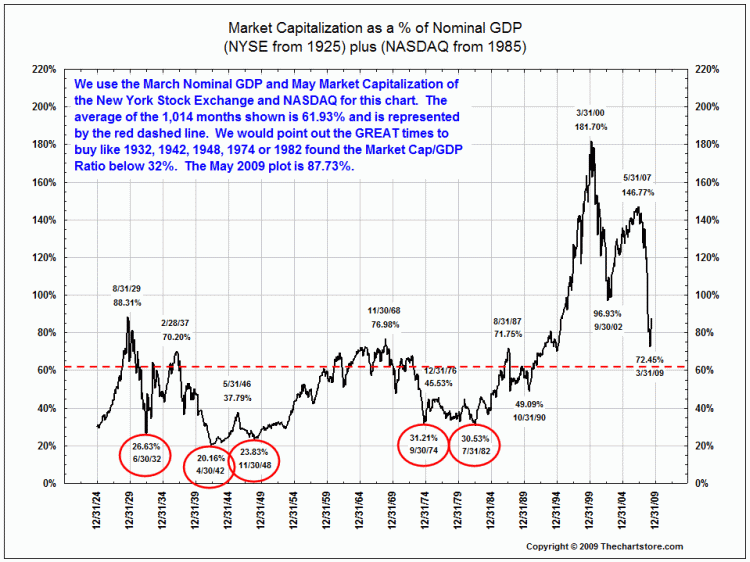
Well, anyway, hot shot engineers and mathematicians used to come into my office and sneer at it. The chart looked awful then (1999-2000). It was zooming up with no end in sight, but these guys were 100% invested in the market, and most of them over-weighted in tech. stocks. They were leaders in the field and, justifiably, felt that they had specialized knowledge that gave them an investing edge. They lost their shirts (well, their 401(k)s anyway) in the crash, and I tactfully took it down.
I still think it is worthwhile keeping in mind.
Vanguard used to publish this in their dead tree version of "In the Vanguard" but I can't find it on their website now.
I got this one from
Market Capitalization as a Percentage of GDP | The Big Picture


