Vanguard Efficient Frontier

IndependentlyPoor

Thinks s/he gets paid by the post
Joined
Jul 1, 2009
Messages
1,142
Location
Austin
Well, I've been at it again.

The chart below shows return of Vanguard funds vs their volatility. It is kinda/sorta shows the efficient frontier for these funds. The data points are color coded by Vanguard's fund categories.
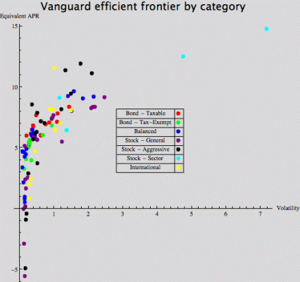
Vanguard Efficient Frontier I.gif
Here is a look at the indexed vs. actively managed funds
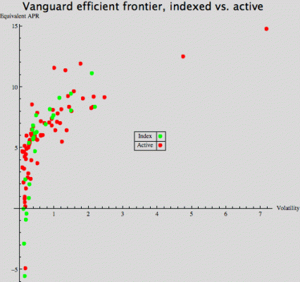
Vanguard Efficient Frontier II.gif
Here is a PDF of of the data, organized by return.
View attachment Vanguard Efficient Frontier by return.pdf
and here is the same data, organized by fund category
View attachment Vanguard Efficient Frontier by category.pdf

You can download an interactive version of the category chart. The interactive versions show the fund name in a little popup when you hover the cursor over a datapoint. Very cool. Here is the link:

http://www.wolfram.com/solutions/in...43&filename=Vanguard+Efficient+Frontier+I.nbp

The bad news is, to use these you have to download a player (sort of like a PDF viewer). The good news is that it is free, and easy to install and use. Here is the link:
Wolfram Mathematica Player: Download

Details:
1. I did not include money market funds because the Mathematica data server doesn't have them.
2. I did not include funds which have less than three years of data available. This avoids extreme results caused by starting the series at just the best or worst time relative to the recent crash and recovery. NOTE: the Mathematica server does not have data going all the way back to inception for some funds, so some funds do not appear even though their inception date is more than three years ago.
3. I calculated the equivalent APR using the standard formula and the total return of the funds at the first and last dates.
4. I normalized the prices of each fund by dividing each daily price by the first price in the fund's series. This puts the standard deviations on more or less an even footing regardless of the NAV.

Usual warning:
I cannot guarantee the accuracy of this information, or even that it makes sense. Do not base investment decisions on this information without independent confirmation.
 
Last edited:
You do great work.
I dont have the time right now to download the player.
However, does the data set include a best fit curve and statistical correlations so that we can judge whether or not there is a meaningful advantage to a active funds?

It seems visually that there might be- but its close.
 
Please Enlighten Me

Perhaps you could enlighten some of us who don't understand your charts or why they would have any meaning.

What is the point(s) you are trying to make here ?
 
I'm not sure I understand the output. For example, how do the Mid Cap Value and Growth indexes have a lower standard deviation than the short-term bond index?
 
I'm not sure I understand the output. For example, how do the Mid Cap Value and Growth indexes have a lower standard deviation than the short-term bond index?

Good catch! My first thought was Oops. Musta goofed.

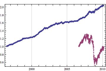
But maybe not. Anybody would certainly say that VMGIX is more volatile than VBISX, but the standard deviations are what they are. The VBISX data is 3447 points going back to 1996, while the VMGIX data is 883 points from 2006. That long period of slow steady growth allowed VBSIX to accumulate more deviation than the shorter, more erratic life of VMGIX. Here is a chart of the cummulative return of both funds:
sdev.gif
Standard deviation doesn't distinguish between gain and loss. I believe that there are some statistical measures that do distinguish, but I am not familiar with them.

The standard deviation for VBISX beginning on the same date as the VMGIX series is 0.0645. Which makes more sense with respect to the VMGIX value of 0.213.

Perhaps I should redo the charts with the same period for all funds.
 
Perhaps you could enlighten some of us who don't understand your charts or why they would have any meaning.

What is the point(s) you are trying to make here ?

Not trying to make any point. Have been looking at some stuff on modern portfolio theory and decided to give it a try.

Who knows whether any of this is of use, or has any meaning at all; certainly not I.

I suppose that I shouldn't have used the phrase "efficient frontier", since I wasn't plotting results of portfolios comprised of "risky" and "safe" securities. I was heading in that direction, but decided that just the plot of return vs. risk was interesting enough to post.
 
Last edited:
Well all I know is, I gave up indexing with a dozen funds of Equites and Their Bonds, I always was just alittle wrong re-allocating every yr per their advice of fellow Indexers and all the added time it required..
and just Hired a Pro firm to run it for me..
That Firm?
Balanced Funds.. VWINX, OAKBX and BERIX
been over 11 yrs since and things are doing just fine..and gave me alot more time to enjoy my life..


BTW.. the dif. btwn keeping that port of index funds vs just VWINX for past 11 yrs? less then 0.5% apy.. but VWINX made more $ ( Per $10k, $18.8k for the index port and over $20k for VWINX) and the other Bal Funds? Beat it considerably.
 
Is the standard deviation not divided by the number of points or years or something? That does look a little weird.
 
Well all I know is, I gave up indexing with a dozen funds of Equites and Their Bonds, I always was just alittle wrong re-allocating every yr per their advice of fellow Indexers and all the added time it required.. . .

BTW.. the dif. btwn keeping that port of index funds vs just VWINX for past 11 yrs? less then 0.5% apy.. but VWINX made more $ ( Per $10k, $18.8k for the index port and over $20k for VWINX) and the other Bal Funds? Beat it considerably.

Seems like accurately tracking the performance of a hypothetical portfolio of funds that are hypothetically rebalanced over 11 years would be more work than actually owning them and simply rebalancing them once every year or so. :confused:
 
Is the standard deviation not divided by the number of points or years or something? That does look a little weird.
Doh.gif
Homer Simpson moment.

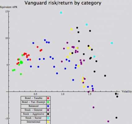
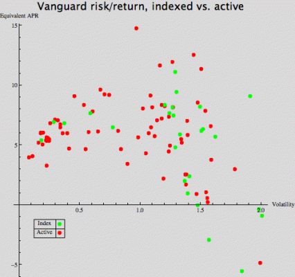
Here is the same data with standard deviations calculated using daily fractional changes in NAV, not the NAV itself; and boy does it change everything.
Vanguard risk return I.gif
Vanguard risk return II.gif
Here are the tables
View attachment Vanguard risk return by category.pdf
View attachment Vanguard risk return by risk.pdf

And here are the interactive charts
http://www.wolfram.com/solutions/in...144947670&filename=Vanguard+risk+return+I.nbp

http://www.wolfram.com/solutions/in...74637880&filename=Vanguard+risk+return+II.nbp

And here is the link to download the player for the interactive graphics again
Wolfram Mathematica Player: Download

Does this comport better with everybody's seat-of-the-pants feelings?
:blush:
 
Apologies for bumping my own, stale thread.

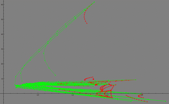
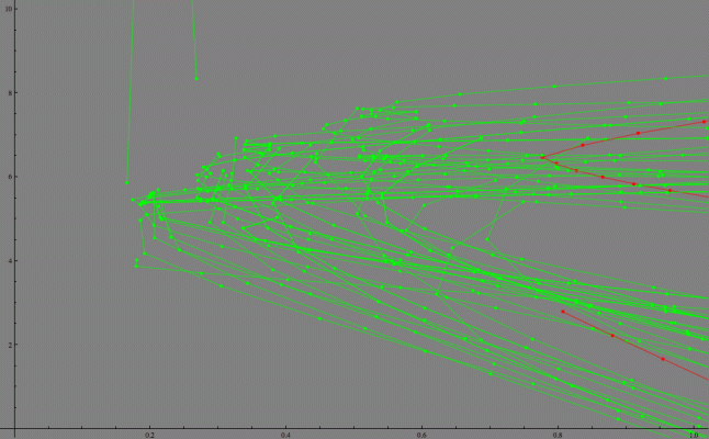
Below are charts of the risk-return of two fund portfolios of Vanguard index funds. There are 400 some-odd pairs of index funds. The charts below are for the 100 least correlated portfolios. I constructed 11 portfolios for each fund pair with varying allocation: 0%/100%, 10%/90%, 20%/80% ... 100%/0%.

The horizontal axis is the standard deviation of the percent daily change of the NAV. The vertical axis is the equivalent APR for the portfolio for the entire time for which data is available. Green points represent portfolios with negative correlation, red points represent portfolios with positive correlation.

Vanguard Efficient Frontier2 full.gif

Detail
Vanguard Efficient Frontier2 zoom.gif

There was too much data for me to label the charts in any reasonable manner. You can download interactive versions of the charts here

http://www.wolfram.com/solutions/in...name=Vanguard+Efficient+Frontier2+publish.nbp

The interactive charts display the fund names and percentages in a pop-up when you hover the cursor over a point.

This requires Mathematica's free viewer, downloadable here
Wolfram Mathematica Player: Download

It seems that modern portfolio theory works to some extent. It is possible to create a portfolio of two funds that has lower volatility than either fund.

This is what happens when a retired engineer buys a copy of Mathematica. :greetings10:

BTW, once you have downloaded the free player, you can peruse the thousands of demonstrations available on the Mathematica site
Wolfram Demonstrations Project
 
Last edited:
Given the time period, they all look pretty reasonable. Stocks are giving lots of volatility and no return. Bonds are giving less volatility and a some return. Looks like a couple for portfolios did pretty well though.
 
Back
Top Bottom