Mods-Didn't see this with a search, please delete/redirect if I missed it.
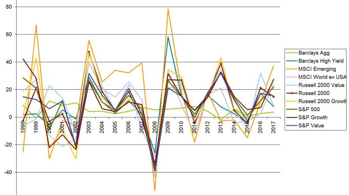
Have found this interesting over the years to see how asset classes move up and down the table. Never found a way to reliably do asset class timing, but have found some comfort that this year's losers become winners later on.
https://www.callan.com/wp-content/uploads/2018/01/Callan-PeriodicTbl_KeyInd_2018.pdf
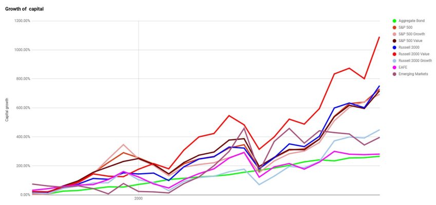
")