Lsbcal
Give me a museum and I'll fill it. (Picasso) Give me a forum ...
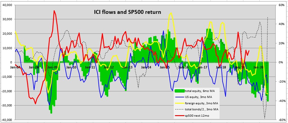
Periodically I update a chart of the data provided by the Investment Company Institute. This includes stock and bond fund/ETF flows.
Below is the chart. I tend to focus on the total equity (green) flows which are shown as a 6 month moving avg (6mo MA). This is the combined flows for the US equity (blue) and the foreign equity (yellow).
I included the 12 month sp500 forward return (red, using right Y-axis). So the red curve is shifted by 12 months relative to the other curves. As you can see the sp500 return is somewhat negatively correlated with the total equity flows.
You can see that the Jan-09 equity flows were highly negative and the next 12 months were quite good for the SP500. Right now the equity flows are highly negative!")
Below is the chart. I tend to focus on the total equity (green) flows which are shown as a 6 month moving avg (6mo MA). This is the combined flows for the US equity (blue) and the foreign equity (yellow).
I included the 12 month sp500 forward return (red, using right Y-axis). So the red curve is shifted by 12 months relative to the other curves. As you can see the sp500 return is somewhat negatively correlated with the total equity flows.
You can see that the Jan-09 equity flows were highly negative and the next 12 months were quite good for the SP500. Right now the equity flows are highly negative!