Lsbcal
Give me a museum and I'll fill it. (Picasso) Give me a forum ...
I update this chart occasionally to get a sense of perspective. Being a semilog chart one can see the growth rates (the dashed red line represents 7% inflation adjusted growth). The chart shows the SP500 comparison decade to decade.
The blue line is our current 2010's decade. There is, of course, nothing special about a decade except it's a convenient way to think about movements and history. A few memorable events are noted on this chart too.
Memories are still fresh of that 2000's rough ride (orange line), so downturn fears are understandable. It has been a relatively smooth ride since 2009.. Hoping for more up-and-to-the-right!") Good luck to all in the 2019 investment year.
Good luck to all in the 2019 investment year.
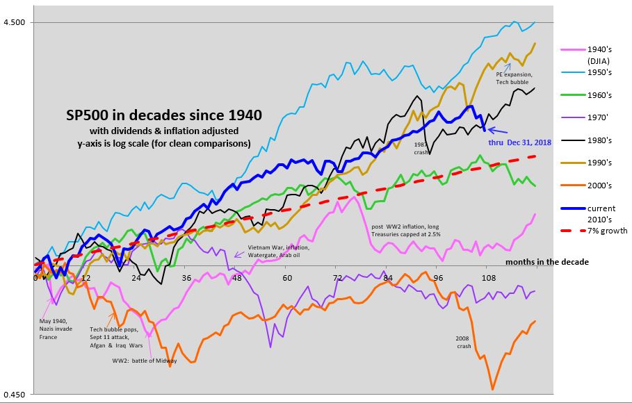
The blue line is our current 2010's decade. There is, of course, nothing special about a decade except it's a convenient way to think about movements and history. A few memorable events are noted on this chart too.
Memories are still fresh of that 2000's rough ride (orange line), so downturn fears are understandable. It has been a relatively smooth ride since 2009.. Hoping for more up-and-to-the-right!
Good luck to all in the 2019 investment year.