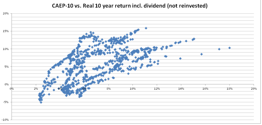
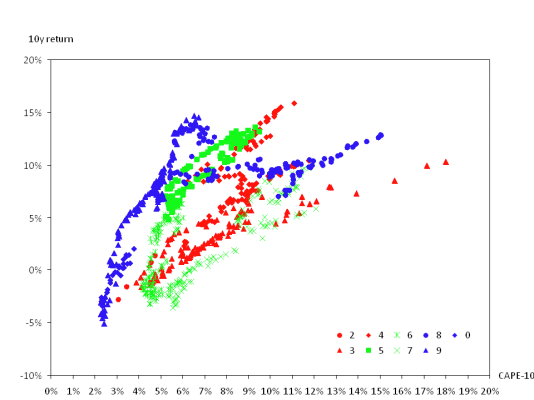
This is a short, two-part series that ought to be of interest to many of us. He's advocating reducing equity exposure to 25% when stocks are in nosebleed territory - as they are right now.
Part 1 is here: Is a High CAPE Cause for Alarm? Part 1: CAPE's Relationship to Stock Returns
And Part 2: Valuation-Based Asset Allocation
Part 1 is here: Is a High CAPE Cause for Alarm? Part 1: CAPE's Relationship to Stock Returns
And Part 2: Valuation-Based Asset Allocation