Upcoming Updates

Andy R

Thinks s/he gets paid by the post
Site Team
Joined
Jan 31, 2007
Messages
1,220
Location
Dallas, Tx
I wanted to post here and give you all a heads up on some updates that will be put in place in the next week or so. The look and feel of the site will be updated and a right column will be added. Since we know that our members get very used to things I wanted you all to know that you will be able to switch back to the current look and feel as well as turn off the right column. That means that we can move forward giving the community a makeover you can keep it looking exactly the same if you want.

The new skin is was developed to be softer and smoother then the current which is very square in style. The color palette is mostly a mix of soft blues and greens. Once the skin goes live we will be asking for feedback so we can tweak the look and feel based on your feedback.

Here is a what the header will look like:
ER header.gif

Here is what the post area will look like:
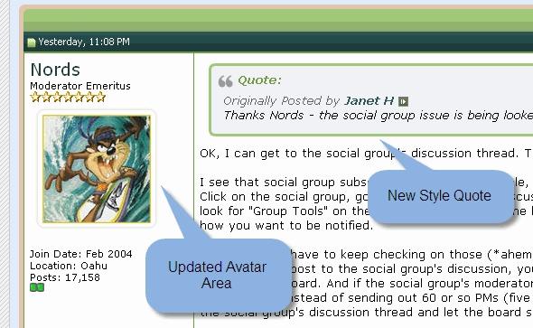
E-R Postbit.gif
 
I'll be first: "I hate it! Switch it back!"
Okay, maybe it will be fine. The little cartoon callouts promised an improved search function--if true, that's a big plus and more important than the look of the thing (radiused corners vs square, green vs blue--I hope no one gets paid money to make these "improvements").
 
Make sure to digest this part:
Since we know that our members get very used to things I wanted you all to know that you will be able to switch back to the current look and feel as well as turn off the right column. That means that we can move forward giving the community a makeover you can keep it looking exactly the same if you want.
It's important to make sure our members are happy and that means enabling you to keep things the way you like it. The default will be the new look but you will be able to set your account so anytime you are logged in you see the site the way you want.
 
As long as things still appear visually in the same geographic part of the page, it doesn't sound like much of an adjustment.
Soft greens and blues sounds nice. :)
 
I really like the new look! I've never had complaints about the current one, but I like the new colors and more rounded design - nice update! :flowers:
 
So many of the vBulletin sites have the same theme/format/whatever--the new design looks great and will make this site distinctive. I'll use it! I love the color palette.
 
As long as things still appear visually in the same geographic part of the page, it doesn't sound like much of an adjustment.
Soft greens and blues sounds nice. :)

I was hoping for pinks and fuchsia, with pastel mauve for an accent color, to attract more chicks and less engineers. :whistle:

Thanks for giving us the option to use the old skin.
 
I was hoping for pinks and fuchsia, with pastel mauve for an accent color, to attract more chicks and less engineers. :whistle:

Thanks for giving us the option to use the old skin.

Well what about chick engineers like freebird and me? :2funny: We're here, after all. :)
 
The colors are nice, but then so are the current colors. I hope we don't give up too much space to the mysterious new right hand column.

Plus, now if I ever type .com by mistake I'll know right away that I'm not where I wanted to be.
 
Humm not sure how how to say this without getting in trouble.

Woman engineers (or scientist in your case) are a rare breed. They, like most men, tend to value function over aesthetics . It seems me one of the things Apple has shown is that you can get women interested in techy stuff, if you do a decent job with aesthetics.

Of course maybe you can get men interested in math and science with things like the ScienceCheerleader
 
I hope we don't give up too much space to the mysterious new right hand column.
Not to worry:
...you will be able to switch back to the current look and feel as well as turn off the right column.
Plus, now if I ever type .com by mistake I'll know right away that I'm not where I wanted to be.
You will never know it because that URL is now automatically forwarded to this forum. :)
 
Humm not sure how how to say this without getting in trouble.

Woman engineers (or scientist in your case) are a rare breed. They, like most men, tend to value function over aesthetics . It seems me one of the things Apple has shown is that you can get women interested in techy stuff, if you do a decent job with aesthetics.

Of course maybe you can get men interested in math and science with things like the ScienceCheerleader

Ha ha!! That might work. I am thinking of a classmate of mine who was more interested in guitar than in our E.E. homework, but who was a victim of family pressure. :)

In my case I was very fortunate to be brought up in an environment in which my interests were not considered to be unusual or inappropriate for a girl. But I know that very few young girls are that lucky.
 
Looks nice Andy. Just make sure you don't mess up the RSS feed :)
 
I presume that the advertising banner will be in a column on the right, correct?

Design is important but no more so than function. Where will the user tools (User CP, New Posts and the like) live?
 
That means that we can move forward giving the community a makeover you can keep it looking exactly the same if you want.
I'll be first: "I hate it! Switch it back!"
Another vote for keeping the "status quo" feature. Too much formatting and not enough content.

Why does vBulletin waste so much screen real estate on letting people know that a quote is about to happen? Is it hard to figure that out now?

I can never remember the significance of the stars & green squares around the avatars. Hopefully vBulletin adds more info when they're moused over.

...and more important than the look of the thing (radiused corners vs square, green vs blue--I hope no one gets paid money to make these "improvements").
What's the Early-Retirement.org font & logo intended to evoke?
 
Just make sure you don't mess up the RSS feed :)
10-4. This will not affect the RSS.
Where will the user tools (User CP, New Posts and the like) live?
Those will all remain in the same place, no change.
Another vote for keeping the "status quo" feature.
All it will take is switching back to the old style and opting out of the side column (just a few clicks.
What's the Early-Retirement.org font & logo intended to evoke?
We experimented with some things like hammocks, sunsets, margaritas, palm trees, beaches, etc but they were all too cheesy. The new logo does not have a specific meaning but I can make one up... It represents FIRE and it's correlation with a beautiful plant that has to grow to mature into a hearty specimen to endure the ups & downs that life brings.

Really, I don't know how the organic leaf shapes got to be part of the design. I was working with the graphics folks and they just put them in there and it looked nice. The colors were selected based on an article I read years ago about the psychology of colors with blue meaning security and stability (ie IBM = Big Blue) and green for finance/money. I have been using the skin as I make changes and IMO it's quite nice. It's not busy, it's soft, subtle and strait forward. I think some of the items will need more contrast to make it as easy to read as possible. I look forward to further refining the look based on everyone's feedback.
 
I like it to be freshened up, too. It sets us apart from the other forums.
And anything can get stale if you see it every day!
Thanks, Andy!
 
I was hoping for pinks and fuchsia, with pastel mauve for an accent color, to attract more chicks and less engineers. :whistle:

Thanks for giving us the option to use the old skin.
Well, in my case you get 2 for the price of 1.
I be a chick.
I be an engineer.

And what the h*ll is mauve anyway?
:LOL:
 
Rita, I think Andy is doing some testing at the moment. I'm sure he will provide some relief instructions soon for those who want it.
 
Freebird, I have a friend who had a whole story about explaining the color "bone" to her husband when she was looking for a pair of shoes.
Someone tried to tell me chartreuse wasn't green once, I told them they'd obviously never done too many shots of the liquor and thrown it up!
 
I don't know if you (Andy) are looking for feedback yet. If not, ignore this one.

I went to my profile, edit options, and clicked right column off. Easy enough, but it didn't work. I logged out and back in, the value is still set to off, but the column is still there. Just fyi.

Also, fyi, I don't like it. Makes the posts a pain to read, and I suspect will create havoc with things like embedded pics and videos and things.
 
Back
Top Bottom