https://www.macrotrends.net/countries/VEN/venezuela/external-debt-stock
https://latinlawyer.com/guide/the-guide-restructuring/second-edition/article/refinancing-venezuelas-debt-local-legal-and-policy-issues
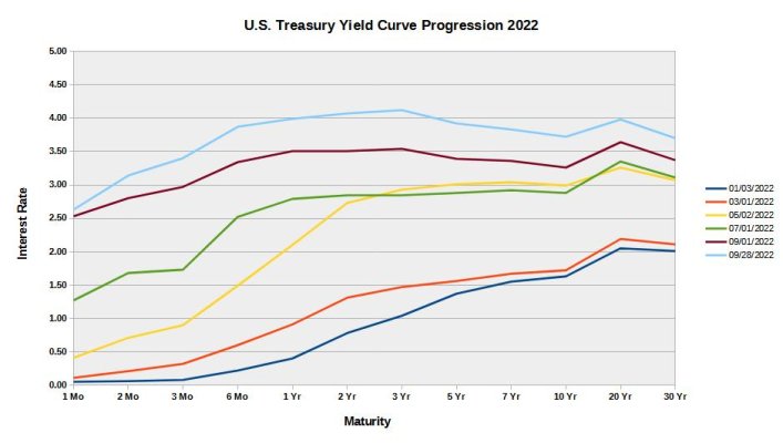
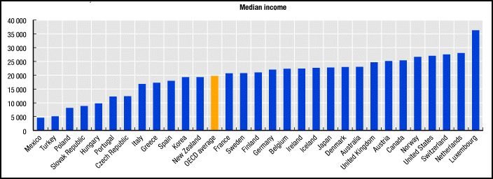
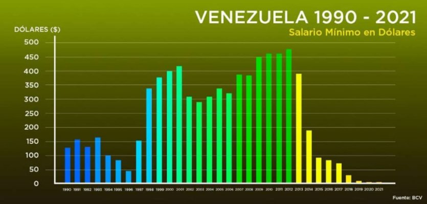
No it was the mathematical outcome of increasing debt by 400% over those 15 good years with no means to repay other than rolling over and increasing the debt, which became impossible. If you think the result in any country would be different if they could not roll over and increase their debt you would be mistaken. It is the same philosophy almost every pension fund is using to pay it's obligations. And in actuality the debt of Venezuela increased a mind boggling 100X from 1975-2016 from $100 per citizen to $10,000 per citizen which today is 5 years of household income. It is a major math problem. US debt is up 55X in that time from $2,000 per citizen (2 months of household income) in 1975 to $100,000 (One year 2 months household income) today. Inflation gets the debt and income back in balance. If interest rates were to hit 7 percent, the necessary payment is one months of household income to merely pay interest. At 2 percent we were paying a week's income. This is what math does to the model of consumption caused by inflation. Controlling interest rates appears a valid method as long you can buy from other countries what you can't produce for promises of debt. It is the halting of additional debt that ends the process for any country.
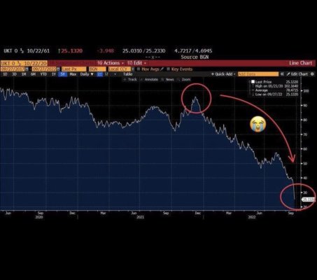
At present the claims against Venezuela are several multiples of it's GDP. Now it may be true that much of the wealth was stolen, but the 15 good years were the crumbs left over. Now there is no cookies or crumbs and it is due to the debt, not the politics which is a separate conversation, but politics change the debt lasts forever until repudiated.