One bull's case

Lsbcal

Give me a museum and I'll fill it. (Picasso) Give me a forum ...
Joined
May 28, 2006
Messages
8,809
Location
west coast, hi there!
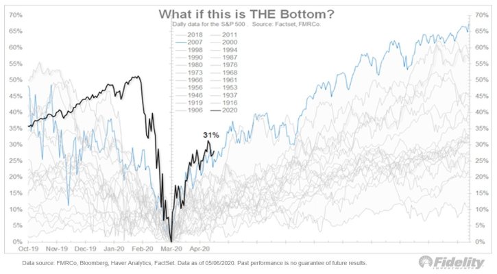
For me this is a scratch-my-head time. This interview with Jeremy Siegel is an interesting bull case study: https://www.cnbc.com/2020/05/08/jer...in-stocks-definitely-going-to-be-the-low.html

Some snippets:
Siegel, a longtime stock market bull, said he believes the only way the stock market could retest the March 23 bottom is if there were a more severe coronavirus outbreak in the fall and full-scale lockdowns have to be implemented once again.

“I don’t think that’s going to happen. I think that’s a low-probability event,” he said, while acknowledging the “second wave” of the 1918 Spanish Flu was far more deadly than the initial outbreak.

The full 8 minute interview is worth listening to. He discusses the Fed stimulus moves which I'm not qualified to assess.

Siegel mentions he follows this medical doctor, Scott Gottlieb, whose twitter feed is here:
https://twitter.com/ScottGottliebMD?ref_src=twsrc^google|twcamp^serp|twgr^author
I think this is a good source for understanding the present and future direction of the virus.
 
Laughable. Dude is a perma bull. The yin to roubinis yang.
 
The black line is today. The blue line is 2007/2009. So is it different this time or does it just feel different this time?
 

Attachments

  • EXg9-5lWAAAiGW5.jpg
    EXg9-5lWAAAiGW5.jpg
    99.5 KB · Views: 130
The black line is today. The blue line is 2007/2009. So is it different this time or does it just feel different this time?
There's a difference, or that's my feeling between past events which were financial crisis and required "only" a single front assault, that being remediation of the financial problem. And today which is driven by a pandemic event, fear mongering media and a financial crisis. Three fronts, all that require remediation concurrently. And based on unemployment numbers, this is significantly different than any prior event reflected in that chart. Interesting chart though.
 
There's a difference, or that's my feeling between past events which were financial crisis and required "only" a single front assault, that being remediation of the financial problem. And today which is driven by a pandemic event, fear mongering media and a financial crisis. Three fronts, all that require remediation concurrently. And based on unemployment numbers, this is significantly different than any prior event reflected in that chart. Interesting chart though.

So the cause and cure are different, but maybe investors always act in a similar way to a crisis? :popcorn:
 
Put me in the starting to get nervous camp. I have a bunch of tech stocks (AAPL almost at 310, MSFT @ 184, ADI @ 109.5, ...). While I can understand the MSFT run up, I am starting to see a lot of "Great Expectations" in some others.

OTOH, there are some (of mine) down 25%+, which do seem to reflect reality.

Dunno, just starting to feel nervous that too much recovery is being priced in here, and getting those same thoughts I had mid Feb when I couldn't understand why everything kept going up when I felt in my heart (and was preparing) that the virus would have a massive impact.

Same here, so I decided since one ETF is down 14% from it's high point early this year, I sold $91K worth.
Will put it into some short term nearly no interest treasury...or CD's
 
The black line is today. The blue line is 2007/2009. So is it different this time or does it just feel different this time?
Interesting pattern.

Why not shift the March '20 low to Nov. 19 since that was when the downturn started, then look again. (i.e. first low to first low) Following the same logic, you might come to the alternative conclusion that we're actually in the first bounce, closely matching the Nov 19 to Jan 20 timespan and the worse drop will be here 4 months after the first low - i.e. July 20. The 2007/2009 rebound is the best-case scenario on the entire chart! (This is also when China [and Chinese trade] was expanding rapidly)

Too bad the chart doesn't show the bottom for the other downturns. I think it would suggest that the market could easily shed an additional 10%-20% below our last low. This feels like a much more extreme event than some others on the chart, including '07-'09.
 
Last edited:
Interesting pattern.

Why not shift the March '20 low to Nov. 19 since that was when the downturn started, then look again. (i.e. first low to first low) Following the same logic, you might come to the alternative conclusion that we're actually in the first bounce, closely matching the Nov 19 to Jan 20 timespan and the worse drop will be here 4 months after the first low - i.e. July 20. The 2007/2009 rebound is the best-case scenario on the entire chart! (This is also when China [and Chinese trade] was expanding rapidly)

Too bad the chart doesn't show the bottom for the other downturns. I think it would suggest that the market could easily shed an additional 10%-20% below our last low. This feels like a much more extreme event than some others on the chart, including '07-'09.

You can see my chart comparing downturns from the peak here: https://www.early-retirement.org/forums/f44/chart-comparing-this-decline-to-1929-1973-and-2008-a-103378.html
 
The market usually bottoms before the economy does. Even if there is a second wave, with the partial reopenings that are going on, it is possible that the economy has too even if the recovery is slow. I don't know what will happen, but if I feel like any move I might make would be wrong.
 
Interesting pattern.

Why not shift the March '20 low to Nov. 19 since that was when the downturn started, then look again. (i.e. first low to first low) Following the same logic, you might come to the alternative conclusion that we're actually in the first bounce, closely matching the Nov 19 to Jan 20 timespan and the worse drop will be here 4 months after the first low - i.e. July 20. The 2007/2009 rebound is the best-case scenario on the entire chart! (This is also when China [and Chinese trade] was expanding rapidly)

Too bad the chart doesn't show the bottom for the other downturns. I think it would suggest that the market could easily shed an additional 10%-20% below our last low. This feels like a much more extreme event than some others on the chart, including '07-'09.
No, the downturn did not start in Nov. The market peak occurred in late Feb 20.
 
It is different in that it is the government intentionally causing a crash in the economy to fight this virus. Will that matter 3 years from now? I don't know.
 
Interesting pattern.

Why not shift the March '20 low to Nov. 19 since that was when the downturn started, then look again. (i.e. first low to first low) Following the same logic, you might come to the alternative conclusion that we're actually in the first bounce, closely matching the Nov 19 to Jan 20 timespan and the worse drop will be here 4 months after the first low - i.e. July 20. The 2007/2009 rebound is the best-case scenario on the entire chart! (This is also when China [and Chinese trade] was expanding rapidly)

Too bad the chart doesn't show the bottom for the other downturns. I think it would suggest that the market could easily shed an additional 10%-20% below our last low. This feels like a much more extreme event than some others on the chart, including '07-'09.

The chart isn’t mine, it’s from Fidelity and it’s a hypothetical on what if the bottom is in. The common matching point across all the previous downturns in the chart is the low and the bounce off the low. So if the bottom is in, the bounce we just had is not unprecedented. We just had a similar one 11 years ago.

Remembering 2009, folks were sure a second shock would hit and another leg down was coming. I am not saying a new low couldn’t happen today, but sometimes when history doesn’t repeat, it at least rhymes.

2009 was the second leg down from the latter half of 2008. This looks like Fido trying to calm the Muppets and shore up its business.
 
2009 was the second leg down from the latter half of 2008. This looks like Fido trying to calm the Muppets and shore up its business.

It’s a demonstration of what previous markets have done off the low. It’s up to you to decide if we had our low or not.
 
It’s a demonstration of what previous markets have done off the low. It’s up to you to decide if we had our low or not.

Frankly, it is disingenuous. Appears to be a cherry picked chart to show what the marketing department at Fido wanted to show. YMMV.
 
Frankly, it is disingenuous. Appears to be a cherry picked chart to show what the marketing department at Fido wanted to show. YMMV.

It was buried in a tweet from one individual I follow at Fidelity so it wasn’t something they were using for any marketing reason. I doubt you could even find the chart anywhere on Fido’s site.

It was an interesting exercise in “what if”. Something to ponder. The yin to yang.
 
Interesting pattern.

Why not shift the March '20 low to Nov. 19 since that was when the downturn started, then look again. (i.e. first low to first low) Following the same logic, you might come to the alternative conclusion that we're actually in the first bounce, closely matching the Nov 19 to Jan 20 timespan and the worse drop will be here 4 months after the first low - i.e. July 20. The 2007/2009 rebound is the best-case scenario on the entire chart! (This is also when China [and Chinese trade] was expanding rapidly)

Too bad the chart doesn't show the bottom for the other downturns. I think it would suggest that the market could easily shed an additional 10%-20% below our last low. This feels like a much more extreme event than some others on the chart, including '07-'09.

Agree - shift the pattern so the initial down movement for 2007 aligns with 2020.
 
The chart isn’t mine, it’s from Fidelity and it’s a hypothetical on what if the bottom is in. The common matching point across all the previous downturns in the chart is the low and the bounce off the low. So if the bottom is in, the bounce we just had is not unprecedented. We just had a similar one 11 years ago.

Remembering 2009, folks were sure a second shock would hit and another leg down was coming. I am not saying a new low couldn’t happen today, but sometimes when history doesn’t repeat, it at least rhymes.

Thanks for the interesting analysis. I think Lbscal's chart captures my suggestion perfectly.

(It sure would be cool to be able to view these charts in comparison to the policy decisions made at the moment.)
 
Last edited:
Agree - shift the pattern so the initial down movement for 2007 aligns with 2020.

What you are all missing is the point of the chart was to align all the downturns at the low and show a case as to why we had the incredible bounce back. We’ve had them before. Hence the title of the chart, “what if this was the bottom.”

It’s just another side. Take it for what it was meant to be. Something to ponder.

With all the opposition to the chart in this thread, which is an alternative point of view, it makes me wonder why. Which actually makes me think the chart could be right. :LOL:
 
It's just pure madness to look at all these past charts and try to glean any useful information about what lies ahead. Of course there will be lows in the charts, recessions, crisis, flash crash, you name it. One thing is for sure, something is going to happen again that will cause a sell off...unfortunately none of us have any idea when or by how much. When you look at all these charts/plots over a couple of years time they look ominous. Zoom out and look at the proper time horizon to have any business being invested in stocks, and it's just loud noise.
 
Last edited:
It's just pure madness to look at all these past charts and try to glean any useful information about what lies ahead. ...
+1

Any good technical analyst also considers the orbital positions of both Saturn and Venus before making any predictions. It is not a simple matter of drawing lines and perceiving patterns in random data. There must be science involved too.
 
Back
Top Bottom