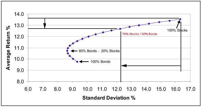
The graph is what is called the "efficient frontier." It documents past relationships between return and price volatility, with volatility expressed as standard deviation and called "risk." It comes from Harry Markowitz' "Modern Portfolio Theory" first described in his PhD these in about 1951.
The problems with the graph IMO are twofold. First, people think that it is some kind of forecast. It is not. Second, while volatility is risky for people who must sell regardless of market condtions, it is a complete don't care for long term investors. For them risk is Enron, Worldcom, Sears Holdings, Theranos, etc. MPT does not consider the latter kind of risk.
The problem with using standard deviation is that it is based on a normal aka Gaussian distribution of samples. Market prices are anything but Gaussian. The distribution is skewed, asymmetric, not centered on zero, has fat tails, and, most importantly, the samples are not independent. Any advocate of momentum investing will tell you that they are not independent.
I am not a fan of the efficient frontier notion, except as just another partially flawed way to look at the unpredictable animal that is the market. YMMV, however. (Markowitz argues that the fact that the market is not Gaussian is an unimportant factor. And, to be fair, he is the guy with the Nobel.
")
)