Lots of good news today

Status
Not open for further replies.
Good news for some are the recent news that those with type O blood may not suffer as bad effects if infected. The theory is perhaps due to less clotting.
 
This isn't good or bad news, it is what it is.... a cool graphic.

That is a very interesting graphic. But according to the graphic the western U.S. has had very few cases as compared to the eastern U.S. I thought California was "hotspot" but not according to this graphic.
 
That is a very interesting graphic. But according to the graphic the western U.S. has had very few cases as compared to the eastern U.S. I thought California was "hotspot" but not according to this graphic.
It may be normalized per capita. CA is actually way down the list in # cases per 1M population.
 
That is a very interesting graphic. But according to the graphic the western U.S. has had very few cases as compared to the eastern U.S. I thought California was "hotspot" but not according to this graphic.

I agree that it is interesting, but I have no idea what it's really telling me (is there a link to the source?).

Are these "cases" (which are highly dependent on the number of tests performed, which varies from area to area), or hospitalizations, or deaths? All the data is somewhat questionable, but "cases" is the least consistent of all, from what I've been able to determine.

-ERD50

I think that's an important point. "Cases" seem to be more dependent upon how hard we look. Hospitalizations, deaths and, especially changes in these seem more instructive and, dare I say it, more reliable in determining the state of the pandemic - but YMMV.
 
It may be normalized per capita. CA is actually way down the list in # cases per 1M population.

It may be, or it may not be. Without details, this is just a cool image and nothing more.
 
That is a very interesting graphic. But according to the graphic the western U.S. has had very few cases as compared to the eastern U.S. I thought California was "hotspot" but not according to this graphic.

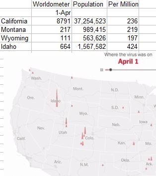
It came in an email from the NYT. I reviewed the email and it doesn't say where the underlying data came from. But I was curious, so did a little analysis...froze the animation on April 1 and looked up a few values on worldometer. I think the reason California came out looking better is that the data is probably by county, so even though on April 1 they have 'the same' rate as some other states, the cases were spread out and below the threshold to show on April 1. Please don't interpret this post as any kind of defense for the graphic...the only claim I make about it is that it's an interesting way to present data.
 

Attachments

  • aprilfirst.jpg
    aprilfirst.jpg
    25.4 KB · Views: 402
It came in an email from the NYT. I reviewed the email and it doesn't say where the underlying data came from. But I was curious, so did a little analysis...froze the animation on April 1 and looked up a few values on worldometer. I think the reason California came out looking better is that the data is probably by county, so even though on April 1 they have 'the same' rate as some other states, the cases were spread out and below the threshold to show on April 1. Please don't interpret this post as any kind of defense for the graphic...the only claim I make about it is that it's an interesting way to present data.

Here is a link to the NYT where the graphic was published. https://www.nytimes.com/interactive/2020/10/15/us/coronavirus-cases-us-surge.html

I infer that it is based on the Times' own database, the construction of which they discuss in detail here: https://www.nytimes.com/article/cor...action=click&module=Spotlight&pgtype=Homepage
 
Thanks for finding the details on the data. So my guess that it was the per 1000 by county case count ended up to be a good guess. The case count, they say and we all acknowledge, is imperfect as it depends on the rate and accuracy of testing, both of which have been improving. So comparing the density of red in an earlier peak isn't quite comparable to the density of red as this next peak builds, but that doesn't stop it from being a cool way to present the data. I like that it's by county...state totals aren't as interesting to me.
 
The Dr. Gottlieb interview with Face the Nation on Sunday was the first time I had heard that like the Shingrx vaccine the Covid-19 vaccine will require 2 doses.

.
 
The Dr. Gottlieb interview with Face the Nation on Sunday was the first time I had heard that like the Shingrx vaccine the Covid-19 vaccine will require 2 doses.

.

JNJ and Merck are both testing single dose vaccines. Merck's is oral.
 
The Dr. Gottlieb interview with Face the Nation on Sunday was the first time I had heard that like the Shingrx vaccine the Covid-19 vaccine will require 2 doses.

.

If the Covid vaccine does require 2 doses I hope there is some way that you can be guaranteed the second dose. When it came time for my second dose of Shingrix I was on the phone every day trying to find it and had to drive to another town a long distance away to get that second dose. It was a mess.
 
If the Covid vaccine does require 2 doses I hope there is some way that you can be guaranteed the second dose. When it came time for my second dose of Shingrix I was on the phone every day trying to find it and had to drive to another town a long distance away to get that second dose. It was a mess.

My local pharmacy prioritized people who were waiting for the second Shingrix dose ahead of people wanting their first dose. I did do the calling every day thing until a shipment arrived then zipped down and got my second dose.

I expect the coronavirus vaccine to be done the same way.
 
My local pharmacy prioritized people who were waiting for the second Shingrix dose ahead of people wanting their first dose. I did do the calling every day thing until a shipment arrived then zipped down and got my second dose.

I expect the coronavirus vaccine to be done the same way.

That is how it should be done--but pharmacies in my area did not prioritize second dose people--it was every person for themselves. Friends of ours had to wait a year for the second dose.
 
https://www.msn.com/en-us/health/me...he-darkest-of-the-entire-pandemic/ar-BB1a9ri6

next 6 to 12 weeks will be the darkest of the entire pandemic.

"vaccines will not become available in any meaningful way until early to third quarter of next year"

I was looking at the daily cases graph and we are almost back to the highest peak of summer.
Yes we are, and on a fast trajectory which indicates there will be considerable overshoot - just in time for the family holiday gatherings too! I think it’s going to be really hard for many families to scale back their usual holiday parties/meals. But it’s very hard to do large gatherings safely - especially in cold weather. And with community spread at new all-time highs, it’s even more dangerous. In other words - I don’t have a good feeling about this......
 
Sorry - I didn’t realize this was supposed to be the good news thread. Based on recent posts I thought it was the vaccines thread.

The good new is positivity rate is way down in some states including TX. That implies adequate testing finally..
 
Last edited:
Sorry - I didn’t realize this was supposed to be the good news thread. Based on recent posts I thought it was the vaccines thread.

The good new is positivity rate is way down in some states including TX. That implies adequate testing finally..

Thanks. Also deaths seem to be remaining relatively flat to this point.
 
Status
Not open for further replies.
Back
Top Bottom