audreyh1
Give me a museum and I'll fill it. (Picasso) Give me a forum ...
Callan has updated their Callan Periodic Table of Investment Returns to include 2014.
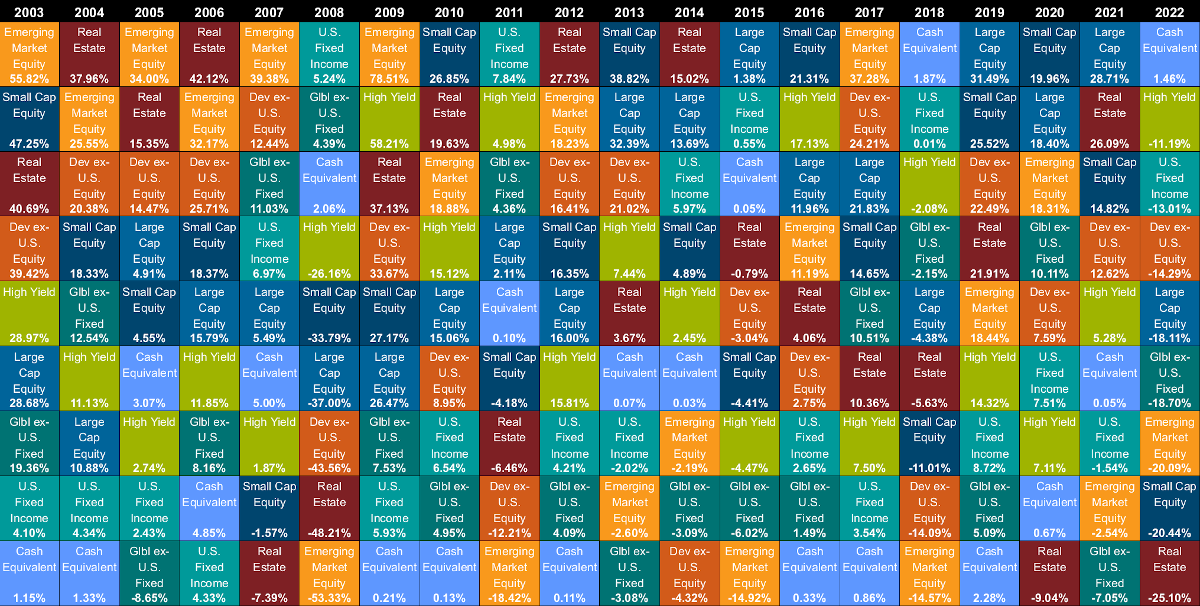
You can see that in 2014, the top performing asset class was the S&P500 Growth (US large cap growth) category. No S&P 500 category has held the top spot since 1998. After all three categories of the S&P500 US large cap (growth, all, and value), the Barclays Aggregate Bond Index which represents the total US bond market all outperformed other equity asset classes. The worst performer in 2014 was the international developed markets (MSCI EAFE). Emerging markets was next worst, and US high yield corporate third worst.
I like to look at this table as a reminder that asset classes that perform well one year, may reverse the next. And sometimes an really poorly performing asset class recovers spectacularly the next year. Sometimes an asset class may outperform or underperform few consecutive years before reversing.
And - it's all relative!!!
The table gives absolute performance as well as relative. Only the international asset classes were negative in 2014. If you look at 2008, you'll see that only one asset class was positive - the US total bond market, and next best performing asset class was down 26% (US Corp High Yield), and was in the same 2nd place position the next year, but had a huge recovery return of 58% the very next year. Bonds are often at the bottom of the pack, but usually still positive even when they lag. If an equity asset class is at the bottom of the pack, it is usually negative, and sometimes really negative!
So absolute matters too - but relatively.")
You can get the whole PDF which also explains what asset class each index represents here: https://www.callan.com/research/files/989.pdf
You can see that in 2014, the top performing asset class was the S&P500 Growth (US large cap growth) category. No S&P 500 category has held the top spot since 1998. After all three categories of the S&P500 US large cap (growth, all, and value), the Barclays Aggregate Bond Index which represents the total US bond market all outperformed other equity asset classes. The worst performer in 2014 was the international developed markets (MSCI EAFE). Emerging markets was next worst, and US high yield corporate third worst.
I like to look at this table as a reminder that asset classes that perform well one year, may reverse the next. And sometimes an really poorly performing asset class recovers spectacularly the next year. Sometimes an asset class may outperform or underperform few consecutive years before reversing.
And - it's all relative!!!
The table gives absolute performance as well as relative. Only the international asset classes were negative in 2014. If you look at 2008, you'll see that only one asset class was positive - the US total bond market, and next best performing asset class was down 26% (US Corp High Yield), and was in the same 2nd place position the next year, but had a huge recovery return of 58% the very next year. Bonds are often at the bottom of the pack, but usually still positive even when they lag. If an equity asset class is at the bottom of the pack, it is usually negative, and sometimes really negative!
So absolute matters too - but relatively.
You can get the whole PDF which also explains what asset class each index represents here: https://www.callan.com/research/files/989.pdf
