We've all been to those websites where you put in your age and health information and the calculator tells you how much longer you have to live...
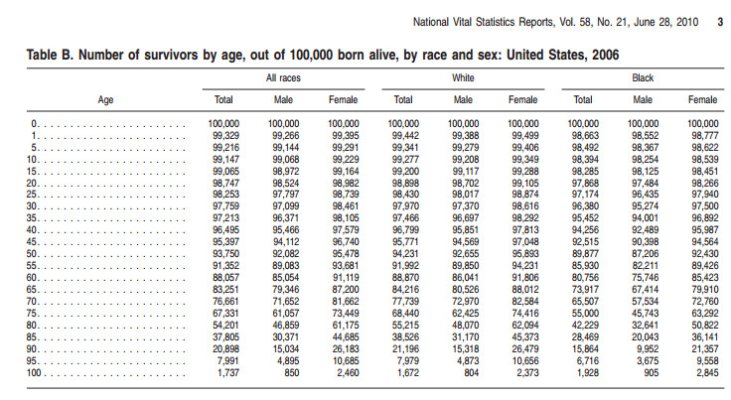
But... if you're interested in how you stand among national statistics for people who were born in the same year as you, here's a chart that gives ballpark figures. In my case it looks like 52% of my age peers have already died.
Just another perspective, based on averages.
But... if you're interested in how you stand among national statistics for people who were born in the same year as you, here's a chart that gives ballpark figures. In my case it looks like 52% of my age peers have already died.
Just another perspective, based on averages.
Attachments
Last edited:
