Can this be right?

IndependentlyPoor

Thinks s/he gets paid by the post
Joined
Jul 1, 2009
Messages
1,142
Location
Austin
I know that I am a conservative investor, but I was surprised at what large equity percentages Firecalc seems to favor. I made Firecalc runs assuming a million dollar portfolio, 40 year period, and everything else default except I varied the percentage equities.

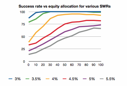
The first plot shows success rates for 3.0, 3.5, 4.0, 4.5, and 5.0 percent withdrawal rates for various asset allocations. (I see that the 40/60 line vanished when I converted to GIF format, but never mind.)
The trend with respect to the withdrawal rate makes sense. Take out more money and risk running out. The trend with respect to asset allocation seems to indicate that more equities are always better.

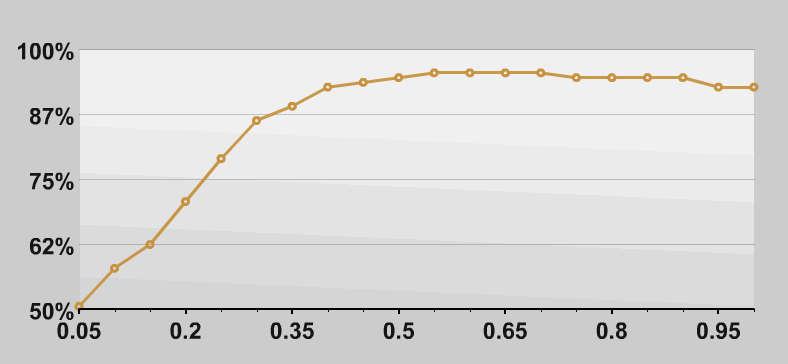
The second plot makes the trend with respect to asset allocation more clear. It shows the success rate for the 4.0% withdrawal rate plotted against percentage equities. This seems to indicate that retirees should be 100% in stocks, maybe even 110% stocks.

I was expecting a sweet spot, a maxima in the second plot. Have I missed something?
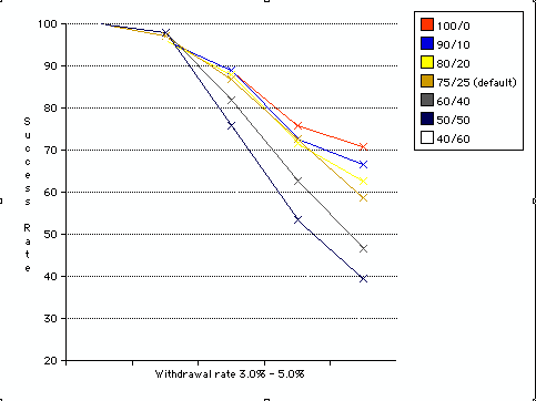
FIrecalc results.gif

Firecalc results 4%.gif
 
It doesn't show standard deviation in those charts, which is the tradeoff with the larger equity portions. If they included that, you'd have a sweet spot of equity portion giving maximum success for maximum withdrawal rate with minimum standard deviation.
 
That's because stocks are actually safer than bonds for long-term investing, once you factor in the inevitable inflation that will eat away at your money. See this link for a very eye-opening analysis:

Are stocks safer than bonds?
 
That's because stocks are actually safer than bonds for long-term investing, once you factor in the inevitable inflation that will eat away at your money. See this link for a very eye-opening analysis:

Are stocks safer than bonds?

Thank you for the link. It is a good one.

I reran my firecalc runs, for equity allocations from 0% to 100% and for withdrawal rates from 3% to 5.5%. I left all of the other inputs at their defaults. I was gratified to see a slight sweet spot in the 4% SWR curve, peaking right around 60% - 70% equities. Firecalc's default 75% equities might actually be the peak.
firecalc results 2.gif
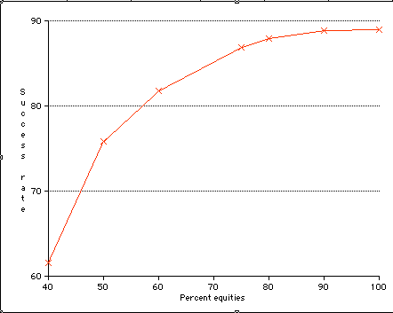
This seems to agree with the Firecalc results from the "Investigate" tab, success rate for a 4% SWR for varyious equity allocations.
firecalc results.gif
I don't disagree with the analysis in the link you provided, but feel that it is just showing the rational behind "age in bonds". When you are retired an living from your investments, volatility over a 30 year period is a little beside the point. I need investment return every year. I don't know what the proper way to look at this is, but I picked my allocation on the "knee" of the 4% SWR curve: about 40% equities, and we try to stay under 4% withdrawal rate. This allows us to "live off the dividends and interest" and remain calm during panicky periods like we just experienced. I know that Audreyh1 takes the opposite, total return view, but hey, that is what makes the world, and this forum interesting.

Here is the spreadsheet of the results if you are interested.
View attachment firecalc results.xls
 
One of the problems with the link provided by 30Fire is... well, averages...

If you say... show me the best and worst year for stocks... show me the best and worst for 3, for 5, 10, 30... even 100... the bars will become smaller... in fact, they will become smaller for most anything, not just stock returns...

This is because the likelyhood of the worst 3 years would occur within the worst 5 years if not somewhere else... there would be 2 'better' years in which to make the 5 years better... the graph looks good and all.. but I don't think it adds much... except to show that stocks over the 30 year period might be 'safer'...
 
The thing is, a very high equity allocation *may* reduce the chances of falling short -- but when it fails it's more likely to fail spectacularly.

It also depends a lot on whether one plans to spend down their principal during retirement or are hoping to live off of investment income and/or capital appreciation over time.
 
This needs a bit of editing for clarity:
That's because American stocks are actually safer than bonds for long-term investing, so far as we can tell from what historical data we've accumulated, once you factor in the inevitable inflation that will eat away at your money, and as long as deflation doesn't rear its ugly head. Because, of course, past performance is no guarantee of future results, and no one wants to live through the post-WWII boom again if we have to make it happen by enduring WWIII.
But that's why we're 92% stocks in our portfolio. There just doesn't seem to be a better alternative.
 
I don't know what the proper way to look at this is, but I picked my allocation on the "knee" of the 4% SWR curve: about 40% equities, and we try to stay under 4% withdrawal rate.

Interesting viewpoint. I looked at it differently (but maybe not any more 'correctly') and thought about how the future scenarios may be somewhat different from the past.

So my rationale was to go more towards the middle of the curve, so I had "room" on both sides that might account for different scenarios. Being on the knee made me think a different future might push my returns down on that slope. I don't know if that is really the way to look at it or not, and we may not even know 30 years from now.

-ERD50
 
:blush: Actually, that was really, really bad wording. I should have said that my asset allocation ended-up on the knee of the curve. I arrived at that allocation by finding the minimum bond allocation that could fund our expenses through interest in dividends alone. For us, that ended up 60% bonds.
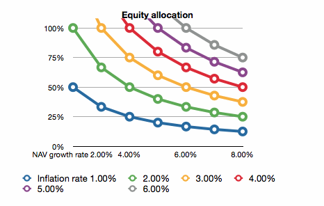
I think it is interesting to calculate what percentage equities would be required to maintain a constant portfolio value in the face of inflation. Suppose you have a portfolio made up of, say, x% VFINX and y% VBMFX and you live from (spend all of) the dividends each year. What percentage VTMSX is required to maintain a constant portfolio value (in real dollars)?
If Rx is the average annual gain of the NAV of VTMSX and Ri is the inflation rate then

x=Ri/Rx.

It turns out that if you plug in the average inflation since 1950 (about 4%) and the average return on the S&P500 since 1950 (about 7%) you get about 60%, the classic 60/40 portfolio.

Below is a chart of this "ideal" equity allocation vs NAV growth rate for various values of inflation rate.
asset allocation.gif
Of course, according to this analysis, we are in trouble for any inflation above 2.8%.

An yes, I know, these are averages and not a stochastic model, but...
 
One of the problems with the link provided by 30Fire is... well, averages...

I agree, averages are meaningless. It is worth remembering that, with a high equity allocation in particular, the sequence of returns can make or break your retirement plans. Retire at the onset of a bear market and your portfolio might never recover from the early losses. Historical averages won't do you any good in that case...
 
FIREdreamer is correct - below average or negative actual returns acheived in the early years can break a retirement plan even if the long run average return ends up exactly where expected.

One of the most succinct explanations is here: The Flaw of Averages
 
Back
Top Bottom