You are using an out of date browser. It may not display this or other websites correctly.
You should upgrade or use an alternative browser.
You should upgrade or use an alternative browser.
Firecalc question
- Thread starter COZICAN
- Start date
The thread was moved to the FIRECalc forum where it will get more focused attention.
USGrant1962
Thinks s/he gets paid by the post
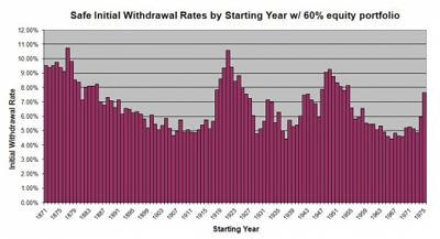
Where can I chart "safe initial withdraw rates"? I've drove myself crazy looking for it.
To determine the traditional SWR you would enter your data then go to the investigate tab. Down where it says "Given a success rate..." set your success rate, click on Spending Level, and submit. The result will be something like:
FIRECalc Results
Looking for a spending level that will result in 95% success rate . . . . . . . . . . . . . . . [done]
A spending level of $29,813 provided a success rate of 95.8% (118 total cycles, of which 5 failed). This spending level is 3.98% of your starting portfolio. (Your spending is assumed to come from any Social Security and pensions you entered, as well as from the portfolio.)
That run was with the default portfolio, 30 years, and 95% success - close to the assumptions in the original SWR studies - resulting in ~4%.
When I run my portfolio/model I usually use 100% success rate to see where I stand.
FIRECalc doesn't "chart" SWRs, but the spending level function charts success rates (%) versus spending levels.
Last edited:
Midpack
Give me a museum and I'll fill it. (Picasso) Give me a forum ...
I'm curious what that chart tells us in practical terms? The title is somewhat of a misnomer IMO, in that the WR's are only "safe" after the fact. Not the same as SWR.This is what I'm looking for. Saw it in another thread.
I'm curious what that chart tells us in practical terms? The title is somewhat of a misnomer IMO, in that the WR's are only "safe" after the fact. Not the same as SWR.
That's exactly what I wanted to determine from it. I thought if I could see my numbers in it it "might" tell me something.
Midpack
Give me a museum and I'll fill it. (Picasso) Give me a forum ...
FWIW, the chart you shared in post #4 is just a variation of the chart below from FIRECALC. Post #4 shows the historical variability of WR's leaving no portfolio residual $, the chart below shows the historical variability of portfolio residual (end $) at a constant WR. The latter is of much more use to me. YMMVThat's exactly what I wanted to determine from it. I thought if I could see my numbers in it it "might" tell me something.
More importantly IMO, both show the value of having a somewhat dynamic withdrawal plan, making adjustments at some frequency (e.g. every 5 yrs). IOW why no one should just blindly follow the withdrawal method** laid out in all the SWR academic studies.
**e.g. 4% of initial portfolio value, increased by inflation for 30 years thereafter no matter what - unless you want to maximize residual $ for heirs/charity.

Last edited:
exnavynuke
Thinks s/he gets paid by the post
Here's where that chart came from
https://www.kitces.com/blog/what-returns-are-safe-withdrawal-rates-really-based-upon/
https://www.kitces.com/blog/what-returns-are-safe-withdrawal-rates-really-based-upon/
youbet
Give me a museum and I'll fill it. (Picasso) Give me a forum ...
A chart similar to this was available in an earlier version of FireCalc years ago. I found it extremely useful in understanding the principals and methodology behind FireCalc testing.
I get a similar result today by using the stat function in Excel to graph some selected data from FireCalc's Excel output.
The chart I miss the most is the one which showed ending values vs beginning year for a given set of input parameters. For example, if you inputted a set of parameters into FireCalc and had 3 instances of failure (negative ending values) you could look and see what specific years those 3 began. Then you could do some interesting head-scratching about that time period to enhance your understanding of why things went south. For example, you might note that all three failure sequences began in years near the beginning of the high inflation period of the 80's.
Last edited:
Here's where that chart came from
https://www.kitces.com/blog/what-returns-are-safe-withdrawal-rates-really-based-upon/
looks like a good read. Thank you!
"The chart I miss the most is the one which showed ending values vs beginning year for a given set of input parameters. For example, if you inputted a set of parameters into FireCalc and had 3 instances of failure (negative ending values) you could look and see what specific years those 3 began. Then you could do some interesting head-scratching about that time period to enhance your understanding of why things went south. For example, you might note that all three failure sequences began in years near the beginning of the high inflation period of the 80's."
that would be interesting indeed.
that would be interesting indeed.
Midpack
Give me a museum and I'll fill it. (Picasso) Give me a forum ...
You still can. Enter your inputs on the first tab, and then check provide data on the Investigate tab before you hit Submit. You get raw data so it might be tedious to review, but it’s there.youbet & COZICAN said:”The chart I miss the most is the one which showed ending values vs beginning year for a given set of input parameters. For example, if you inputted a set of parameters into FireCalc and had 3 instances of failure (negative ending values) you could look and see what specific years those 3 began. Then you could do some interesting head-scratching about that time period to enhance your understanding of why things went south. For example, you might note that all three failure sequences began in years near the beginning of the high inflation period of the 80's."
that would be interesting indeed.
Attachments
Last edited:
Similar threads
- Replies
- 3
- Views
- 313


