REWahoo
Give me a museum and I'll fill it. (Picasso) Give
Earlier today I posted the chart Dory36 uses on the first page of FIRECalc to show how market performance in the first few years of retirement can affect portfolio survival. Bottom line: a bad start can be very bad news.
Not sure if this is of interest to anyone else but me, but I was curious to see how my actual numbers (adjusted to chart values) would look now that we've been FIRED for seven years:
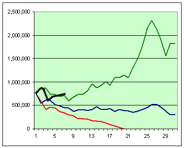
The three examples (red, blue and green) adhered strictly to the 4% plus inflation adjustment formula while I definitely have not. With no pension or SS during the first three years of retirement, our withdrawal rate averaged 7.9% of our initial portfolio value. With both DW and I now on SS our withdrawal rate declined to 3.9% of our initial portfolio value in year seven.
Of course the jury is still out, but I am encouraged that my black line seems to be tracking closer to the path of the green than the blue or red - at least so far.")
Not sure if this is of interest to anyone else but me, but I was curious to see how my actual numbers (adjusted to chart values) would look now that we've been FIRED for seven years:
The three examples (red, blue and green) adhered strictly to the 4% plus inflation adjustment formula while I definitely have not. With no pension or SS during the first three years of retirement, our withdrawal rate averaged 7.9% of our initial portfolio value. With both DW and I now on SS our withdrawal rate declined to 3.9% of our initial portfolio value in year seven.
Of course the jury is still out, but I am encouraged that my black line seems to be tracking closer to the path of the green than the blue or red - at least so far.
Last edited:
