Go all in or easy does it?

Nords said:
Hello, I am Rashid I mean "Bob", how may I be helping you today?

Ah, submarine jokes. I see. One moment please.

Uh, I am reading to you, "long and hard and full of seamen". Does that answer your question? You have the happy day now, good-bye.

(Edited to remove all subtlety.)

Swell. I had to explain why I was laughing again.

"well...you got some time...?"
 
Cool Dood said:
IAt any rate, it's a toss-up as to whether or not the US markets are in for a very near-term drop -- and I don't think NYC Guy offered any evidence that it's actually more likely to drop than not -- and in a few years the markets will undoubtedly be at almost exactly the same place regardless of whether they first rise or fall.

You might well be correct here. But I can't see that as an argument for accepting the risk and volatility of equity aggregates. Furthermore, although you will get some dividends, you also forgo an even larger amount in interest.

Ha
 
I thought I would give NYCGuy a break and link an article in a respected journal that makes some of the same points that he does.

NYCGuy said:
...
Buy and hold is the advice of the generals fighting the last war.  It was very good advice for the bull market of the 90's, but not, in my opinion, for the current long term bear market. 
[...]
There is also a possibility that we will have a slowdown or recession in the next 18 months.  The average stock market decline during a recession is 43%.

http://www.fpanet.org/journal/articles/2006_Issues/jfp0306-art7.cfm defines secular bear market and the cyclical markets within them.  The article also has some suggestions on what to do in these markets.
 
NYCGuy said:
The average stock market decline during a recession is 43%.
I stand corrected on the existence of the data, but I still think the calculations & conclusions are invalid.

The article indeed does show some scary numbers in table 3. It does present the word "average" with numbers in the negative 40s.

I don't think that the arithmetic averages of a percentage is the same as claiming that the DOW is going to drop 43% during the next recession. But my speculation is as valid as NYC's claim.

I will agree that it's a very bad idea to sell out your portfolio after it's lost 43%. I would not use that as a reason to keep over $100K in cash. Instead I'd look at the studies that show a long-term market (at least a decade) rises three-quarters of the time, and another study's claim that DCA investors actually lag market returns of the lump-sum investors. The advantage of DCA is the disciplined savings that it imposes on its practitioners, not higher returns over lump-sum investors.

I wonder how much money Olav has lost by sitting on the sidelines. I doubt it's as bad as 43% but I'd bet that with reinvested dividends it's a number he regrets missing out on.
 
Here's another example of market timing that has a track record and academic review (which gives the lie to the claim that "no studies have shown that market timing works.") See Mark Hulbert's article:

http://tinyurl.com/pofgw

This mid-term indicator has been evaluated since 1968 and has been shown to account for more thant 40% of differences in the (US equity) market's return over a four-year period.

Here are Hulbert's conclusions for the next four years based on the current reading of the VLMAP:

"The VLMAP currently stands at 35%, a relatively low number. Fewer than 5% of readings since the mid 1960s have been any lower.
What four-year return does a 35% VLMAP translate into? The econometric model that most closely fits past relationships between VLMAP and the Value Line Geometric Index suggests that this index will be 12% lower in four years' time.
To be sure, this result isn't quite as bad as it seems. The Value Line Geometric Index is constructed in such a way that it understates the return a portfolio would earn by investing in the 1,700 stocks that make up that index. So a 12% decline in the Value Line Geometric doesn't mean that the average investor must also lose that much.
Still, no matter how you slice it, a VLMAP of 35% does not hold out the prospect of very impressive overall returns between now and March 2010."

This agrees with low expectations for equity returns in the coming period (variously defined) put out by Mauldin, Stein & DeMuth, and John Hussman, among others. It concurs with my advice to the OP that stocks are still highly priced and now is a time to wait out the market, whether in short-term fixed or elsewhere.
 
Its interesting stuff but...

Did this measurement system predict the bull market in the late 90's? Did it predict the bear market in the early 2000's?

Track records and academic review need to have that 'historic' thing throw in. Markets do not move in short term periods on the basis of rational metrics.

As far as the housing bubble, I note that in the newfangled chart of housing values, that the recent slope is quite alarming...but...it went almost nowhere for many years before that. Maybe rather than a bubble what we've seen is an upward correction.

Hard to say...all I know is the stuff is clear as glass in the rear view mirror and as clear as mud through the windshield.

I also know that people who are afraid of equities will read a lot of charts that confirms that fear, while people who dont fear them will look at lots of charts that confirm that attraction. No matter how many charts or impressive names you throw out will result in either 'clan' giving honest shrift to the others charts, or anyone changing their minds.
 
Cute n' Fuzzy Bunny said:
Did this measurement system predict the bull market in the late 90's? Did it predict the bear market in the early 2000's?
Track records and academic review need to have that 'historic' thing throw in. Markets do not move in short term periods on the basis of rational metrics.

Here's an analysis of Hulbert's view that includes a pretty information graph to answer just your question. VLMAP has done pretty well:
http://tinyurl.com/zaye5

Cute n' Fuzzy Bunny said:
As far as the housing bubble, I note that in the newfangled chart of housing values, that the recent slope is quite alarming...but...it went almost nowhere for many years before that. Maybe rather than a bubble what we've seen is an upward correction.

Here's my favorite graph on the housing bubble from Schiller at Yale, who apparently did the first national study of housing prices. His graph covers 1890 to 2005 and shows real prices, not nominal. The dramatic up spike after WWII is what we would expect from pentup demand and the expamsion of the home-owning class by veteran's benefits. The spike from 1995 cannot be explained by fundamentals, in my opinion, and is the precursor to a large bust. From 1890 until about 1995, in real terms, there is basically no change. This is reasonable when you consider that the price of a house should be roughly 30% of a family's income and will adjust only for inflation.

Cute n' Fuzzy Bunny said:
I also know that people who are afraid of equities will read a lot of charts that confirms that fear, while people who dont fear them will look at lots of charts that confirm that attraction. No matter how many charts or impressive names you throw out will result in either 'clan' giving honest shrift to the others charts, or anyone changing their minds.

I think the challenge of investing is to keep as many contradictory viewpoints and facts in your head as you can while continuing to make choices. I like asset allocation very much and expect that eventually that is what I will do, but I expect to pay close attention to as many dissenting viewpoints as I can tolerate. I took large and not always well-considered risks when I had very little, but now I intend to have a bias toward avoiding risk to protect my little stack of nickels, without forgetting about inflation either. The alternative of latching onto a single viewpoint and sticking with it might be psycologically easier. I keep in mind Benoit Mandelstams' observation, "The markets are riskier than they look." Perhaps never more so than when volatility is low.
 
Is it just me or does that 'projected price' vs 'actual price' graph show really no correlation between the 'projection' and the 'reality'? I read the text but honestly it looks to me like any perceived correlation has to be pretty inventive.

I saw Schillers chart and the commentary along with it, that spawned my above comment. Many decades of nearly flat price appreciation (in fact, static since 1940), then an upshoot. I'm finding it a little hard to comprehend since home prices have escalated during that time, yet that apparent reality isnt shown in this chart. Maybe I just dont understand what its trying to say. It certainly doesnt help that the associated commentary mentions about 7 times that they dont know if the chart says anything at all, let alone anything that can be interpreted or used.

As far as investing, if you cant afford to lose, then I guess you have to play that way. I've looked at the options, and except for portfolios with at least a good size chunk of equities...they're probably going to lose. Ones with equities, even at high valuations, are probably going to win. Hmm...probably going to lose but not big or all at once, or probably going to win, but maybe after experiencing a lot of volatility...?

Tough question.
 
You're not paying attention. Shiller's graph is real housing prices, i.e. with inflation backed out. So the housing booms of the 70's and 80's reverted right back to historical norms, after you take out the effects of consumer inflation. The commentary on that page is not Schiller's, it's by some blogger. Schiller's graph indexes housing values at 100 in 1890. The prices go down, in real terms, during the Depression. Later they spike up big time in the late 40's as the soldiers start housholds with veterans' benefits. The net effect is by 1995, using Schiller's index, housing values are back at an index value of about 100! That means that all the apparent growth in prices from 1890 until 1995 is attributable to inflation. From 1995 until 2005 the index value suddenly shoots up to 185, an 85% increase in real value, not including inflation. This has never happened before and is not attributable to fundamentals, which he also graphs: construction costs, population growth or general money costs as represented by the real rate of return on the 10 year Treas. bond, all of which keep more or less to trend. That's the picture of this bubble--values break dramatically away from historical norms, not because of any fundamental change, but because an ocean of cheap mortgage money became available.

Not intuitive, is it? Schiller thinks people are unable to adjust for the effects of inflation when considering housing costs because they don't buy and hold anything else over such long periods of time.

As for stock investing, my point with the citations from John Husmman and Hulbert's piece on the VLMAP indicator, is that expected returns from the stock market in the next few years are lower than the historical average. But this doesn't mean however that the risks will be any lower. Therefore one should consider carefully whether that is a good bet to make. I think houses will revert to historical valuations and then grow again at the rate of inflation. That mean sthat they are not a good investment now. Of course there are voices saying it's always a good time to buy real estate just like the voices that say it is always a good time to buy stocks. Equities will eventually be a better bet. In the meantime some will buy and hold and wait and some will just wait. For those who can afford to lose, be my guest.
 
NYCGuy said:
Of course there are voices saying it's always a good time to buy real estate just like the voices that say it is always a good time to buy stocks....

...and voices saying the only safe place to be is in cash while we wait for the right opportunity to buy real estate or stocks sometime in the future.

For those who think they know which voices are correct, be my guest.

Waiting for the right opportunity is also a risk. Since many of us don't know when, or if, that opportunity will come along, we choose diversify and allocate our assets in whatever fashion we deem best and get on with our lives.
 
Thats pretty much what I think too Wahoo. Anything can happen and I dont know and neither do any of the 'experts'. The difference is that I'll openly admit it.

I'm not into creating graphs to show me what I already want to see, and I dont know where the market is going. I didnt like equities 2 years ago or even a year ago, feeling they were overpriced, but earnings have continued to uptick and now I feel ok with them. I still held stocks the last 2 years and made plenty of money on them, overpriced though they might have seemed to me.

Good asset allocation still wins the day, and admitting that you dont know where things are going to go is the first hard step.

Now if things were really nutty, like they were in 1999, i'm with the 'wow, thats expensive, dont own that asset class!' crowd. But a P/E thats 5-10% over long term historic 'norms' doesnt make me twitch. And real estate is very overpriced in a lot of areas, no argument. But I dont know if anythings going to pop or slide or go sideways or go up.

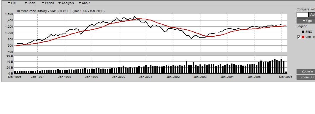
Here's an indicator that works almost all the time though, and appears to have much better consistency than the ones that have been bandied about in this thread. Plot the s&p 500 and the 200 day moving average. When the average dips below the price line for 5 trading days, sell. When it moves above the price line for 5 trading days, buy. This approach would have kept you out of stocks for almost all of the downturns in the most recent 25-30 years and probably further back than that but I'm too lazy to look. Would have had you all in for the upturns.

The price chart has bounced off the 200 day MA a couple of times in the last year, and even done a few short dips below, but right now its in solidly saying to Own 'Em Baby.

Check it out with your favorite charting product...its pretty accurate...historically speaking...
 
Look at this...all in for the greatest bull market in history...the one nobody saw coming, and out for the bear that followed until it stopped dropping...pretty undeniable...
 

Attachments

  • last ten years.JPG
    last ten years.JPG
    60.3 KB · Views: 44
  • last ten years.JPG_thumb
    6.8 KB · Views: 1
"But Shtoopid!"

Seriously though, this is a highly pooh-poohed charting tool. Anyone who ever took a lot of finance and investing classes knows for sure its a complete hoo-hah useless stat that just sort of happens to work almost all the dang time.

Its momentum. When things start to drop through the floor against long term price trending, they tend to continue going that way. Same for the upturns. Try it with your favorite index. Doesnt work as well for individual stocks...
 

Latest posts

Back
Top Bottom