Help with Tracking My Progress in a Non-linear Way

studbucket

Recycles dryer sheets
Joined
Mar 19, 2011
Messages
139
Location
Kirkland
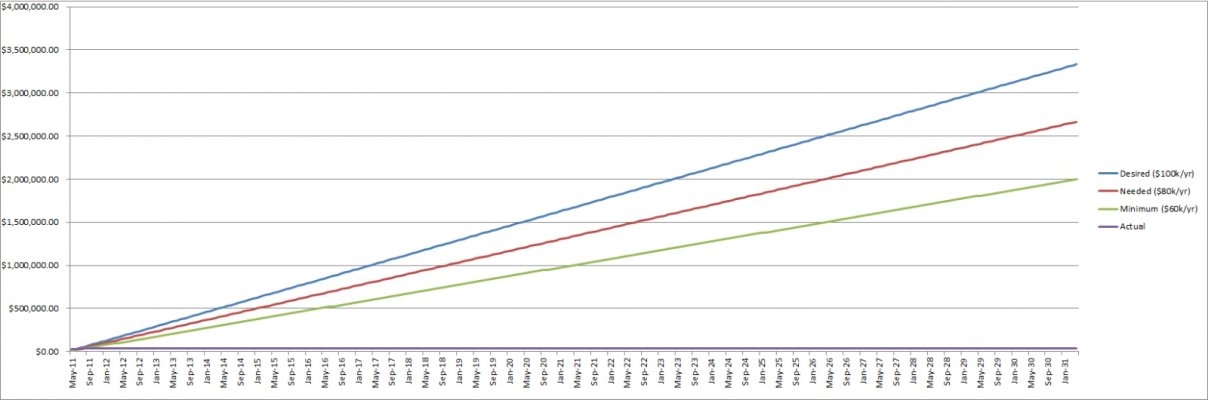
In the attached image, you'll see a graph one of the spreadsheets I've been using to track my finances, this one is specifically telling me how I'm doing at working toward retirement. Basically, I have 3 "curves" representing retirement at 64k/year, 80k/year, and 100k/year, and then track my current retirement assets against where I should be for those goals.

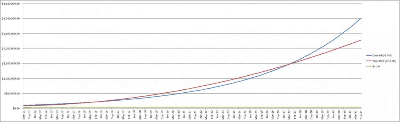
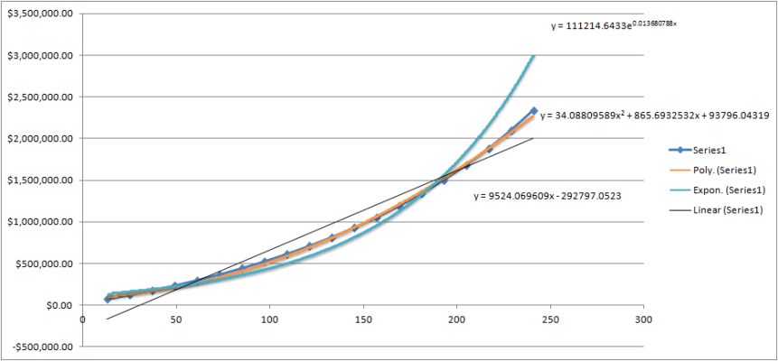
However, those goals are currently being measured simplistically and linearly. It shows that I need to be saving or making $8000/month. Right now, that's not realistic (we're saving $2-3k/month and the market is not going up). I' realized that perhaps I need some sort of non-linear formula or model to best track this, because that's more like how my money will be made. I'll be (likely) saving up a lot more 10 years from now than I am today, as I make more money.

With that background, do you know of a formula I should use to represent that. Would x^1.3 or something like that be what I'm looking for?

Thanks!
 

Attachments

  • retirementtrend.jpg
    retirementtrend.jpg
    160.2 KB · Views: 53
I' realized that perhaps I need some sort of non-linear formula or model to best track this, because that's more like how my money will be made. I'll be (likely) saving up a lot more 10 years from now than I am today, as I make more money.
With that background, do you know of a formula I should use to represent that. Would x^1.3 or something like that be what I'm looking for?
Thanks!
You're estimating that your savings or income would rise in some "linear" exponential percentage... say 10% per year (x^1.10) or 14.3% per year (x^1.143).

I'm not sure why that percentage-rise assumption would be any more or less valid than your current assumptions. For example, popular media used to claim that your 50s and 60s would be your top-earning years as your kids left the nest. Now the media is explaining how to find a new job when you're laid off in your 50s and 60s.

In a more personal example, when I was on active duty I knew that "all qualified officers" would be promoted to 0-2 and 0-3. (Short of a DUI or a major felony, that was about 99% of us.) The promotion rate to submariner O-4s was also about 95% back then, so that seemed like a pretty good assumption too.

But the promotion rate to O-5 was about 60%, so even five years before I was up for O-5 I had decided to project my income at O-4 and not count on making O-5. That turned out to be a very prescient decision. I avoided counting unhatched chickens.

In your situation it might be a more productive use of your time to assume that your income from now on will be flat, and then to start figuring out ways to boost your savings. (Or to find more income from a different source.) The worst outcome of this assumption would be that your income rises more rapidly than you've projected, leaving you ahead of your timeline.
 
I have never thought of my ER planning that way (i.e. non linearly). I have focused mainly on maintaining a frugal lifestyle and keeping expenses low - the rest comes naturally.
With that background, do you know of a formula I should use to represent that. Would x^1.3 or something like that be what I'm looking for?
 
Looking back, my income has increased non-linearly and so did my net worth. So it makes sense to go non-linear. But I don't think there is a universal formula.


When planning for FIRE, however, I basically followed Nords' advice:
Nords said:
In your situation it might be a more productive use of your time to assume that your income from now on will be flat, and then to start figuring out ways to boost your savings. (Or to find more income from a different source.) The worst outcome of this assumption would be that your income rises more rapidly than you've projected, leaving you ahead of your timeline.
I ended up being pleasantly surprised.
 
Last edited:
studbucket, you posted about this graph in another thread a few months back and then sent it to me when I requested it in a PM. So thanks for that.

One change I'd suggest is change the purple line to be a best-fit line based on the data so far, or add another line for that. So right now your purple line is just flat, because it hasn't happened. But you can do a best-fit line based on the data you have (May to present).

Then you don't have to guess if your growth is linear or exponential. And you can use the equation it generates for you to predict what you will be at at a certain point in time.
 
Linear is probably ok for the short term but a semilog plot would probably be better over the long term since it would flatten out the hopefully rapid rise on a linear plot where the growth of assets themselves starts to dominate over the savings component.
 
Thanks guys, appreciate the feedback. This is the least important of my spreadsheets, but it's just a way to see how I'm tracking to my retirement goals, because I'm interested.

I know the growth won't be linear, so I wanted to more accurately measure this. I like the feedback and the thoughts, and I'll play around with Excel and your suggestions and let you know what I do.
 
studbucket said:
Thanks guys, appreciate the feedback. This is the least important of my spreadsheets, but it's just a way to see how I'm tracking to my retirement goals, because I'm interested.

I know the growth won't be linear, so I wanted to more accurately measure this. I like the feedback and the thoughts, and I'll play around with Excel and your suggestions and let you know what I do.

It'll start linear, because the majority of growth will be due to your savings adding to it, not due to the interest it's generating adding to it.

It'll only get exponential later on, as the returns the portfolio generate outpace what you're adding to it. So a best-fit line is likely good enough, for now.
 
I think it will definitely be non-linear because as your career progresses and your earnings grow your disposable income and savings will grow as well. In other words, assuming a similar lifestyle someone earning 65k a year will be able to save more than someone earning 40k a year. Also, the power of compounding would be reflected in your accumulated assets.

What I suggest that you do is do a model of yoru accumulated investment nest egg starting with your current nest egg and savings based on your current earnings, then projecting increases in your earnings, expenses and savings and include investment earnings on those savings and then graph the balances or the annual income assuming a x% SWR.

I would expect the slope to be getting progressively steeper during the accumulation phase due to increasing savings as you income grows and the magic of compounding.
 
My personal retirement spreadsheet is very similar to what pb4uski describes. Mine assumes a raise of 3% / year to my base salary and an increase to my expenses of 3.5% / year (inflation of 3%, and to account for slowly increasing my quality of life over the years I added 0.5%)

This should actually turn out to be conservative as inflation in my province averaged for the last 10 years is closer to 2.2%. I may keep myself from increasing my expenses (quality of life) but that 0.5% should then still be a buffer to unexpected expenses like replacing my car.

My spreadsheet should become more accurate with time as I get a better understanding of how raises and promotions are handled in my career. Though my expected return on my investments will obviously be all over the place on any given year but should hopefully reach an average that is close to my estimated average.
 
Last edited:
PolarisTLX said:
Mine assumes a raise of 3% / year to my base salary

I'm jealous. I'm in a government job with cost of living increases built in to our salary schedule, but all steps have been frozen for the last 4 years, so I'm at 2007 pay still.
 
Nords said:
In a more personal example, when I was on active duty I knew that "all qualified officers" would be promoted to 0-2 and 0-3. (Short of a DUI or a major felony, that was about 99% of us.) The promotion rate to submariner O-4s was also about 95% back then, so that seemed like a pretty good assumption too.

But the promotion rate to O-5 was about 60%, so even five years before I was up for O-5 I had decided to project my income at O-4 and not count on making O-5. That turned out to be a very prescient decision. I avoided counting unhatched chickens.
Different times now, but same environment today, with huge budget cuts looming. I expect promotion rates for Naval Aviators to decrease over the next couple of years. They have already gone down a little, and I think it will only get worse in the near future. I haven't been looked at for O-5 yet, but am doing the same thing you did.
 
Last edited:
Different times now, but same environment today, with huge budget cuts looming. I expect promotion rates for Naval Aviators to decrease over the next couple of years. They have already gone down a little, and I think it will only get worse in the near future. I haven't been looked at for O-5 yet, but am doing the same thing you did.
Sorry to hear that, but it's wise.

I wish I'd been eligible to sign up for one more nuclear bonus contract, too!
 
Studbucket

We spoke awhile back when you first introduced this graph. I took your initial concept and compounded on it a bit. It uses a compound interest concept that lets you put in a few different inputs (interest rate, desired end dollar amount, etc). This makes it a bit less linear but I don't think that's quite what you want.

Because you may not be able to predict your future income you are going to have to make assumptions. Like Nords said, assume realistically but conservatively. If you are really sure that in 'y' years you will get an 'x' raise, then assume in y+1 years you will recieve a .75x raise. Using that, put it into your excel sheet at that year.

Another option is to break up what dollar value you want to be at at certain time intervals and therefore create several linear graphs between shorter periods eventually leading to the end dollar amount.

One last option is to just keep it linear and realize at a later date you will catch up to what the linear calculations should say you're at.

Hope this helps!
 
Last edited:
So I finally got around to creating something that works better than the linear equations I had before. It's not perfect, but I'm happy with it.

First, I attempted to make a rough projection of my income and savings over the next 20 years. I assumed I would continue to get raises, stock, and a bonus every September. However, I assumed a bonus & raise that are less than what I've received my first 2 years at work and had some low assumptions on stock (since stock awards get greater as you stay company longer).

I hope it's a decent way to conservatively project my income & savings.

I now had ~20 data points from September 2012 (I can't remember why I started there instead of 2011) to September 2031. I plotted those on a graph in Excel and found the best fit curves for it Polynomially, Exponentially, and Linearly. The polynomial curve was really close, and after working out some errors* and setting September 2012 = 13 (so Sept 2011 is 1) I had some formulas I wanted to use. I would treat the Polynomial formula as my expected savings, which would get me to about $2.3 Million. The Exponential formula would be my desired savings, or about $3 Million. [See attached best fits.png]

I then updated my "Trend to Retirement" spreadsheet to track against these curves, instead of linearly. [See attached trend.jpg]

I'm now 2-3 years behind schedule, instead of 4-5 months. However, it's no longer telling me to save/gain $8k/month (I don't have to do that until 2020). All I have to do is increase the value of my investments by $1.3k right now, and I'm saving more than that per month, so I'll catch up.

*One error with Excel to be aware of. If you want to, Excel will let you add best fit/trendline curves to line graphs (maybe many others as well), but when you look at the formulas, they are wrong. This help article explains that: Chart trendline formula is inaccurate in Excel

I just wish they would have made that more clear to me so I didn't have to spend 3 hours confused about why the math made no sense. I changed my graph type to an XY Scatter Plot, and the formulas magically changed to ones that made sense.
 

Attachments

  • trend.jpg
    trend.jpg
    136.4 KB · Views: 13
  • best fits.png
    best fits.png
    35.5 KB · Views: 15

Latest posts

Back
Top Bottom