[...] I tried looking at the graph that Yahoo finance plots, but because of recent data, everything before around 1995 or so just looks flat. [...]
So I'd guess that, overall, a 25% drop in the S&P is a relatively uncommon occurrence?
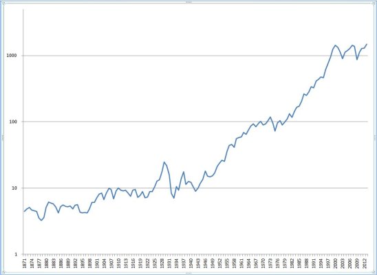
The best way to view long-term stock charts, IMO, is to use a log scale for the vertical axis.
When plotted against a log scale, a given percentage drop (e.g., 25%) will always be the same height on the chart.
Here's what the S&P 500 looks like against a log scale:
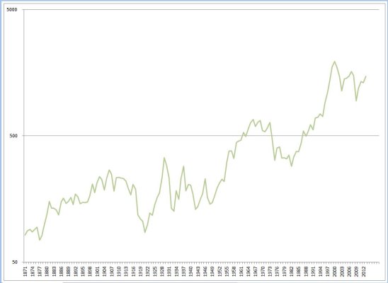
An even better version of this would factor in inflation, so here is the same data adjusted to "real" dollars (2013 dollars) - note the impact of the high inflation years:
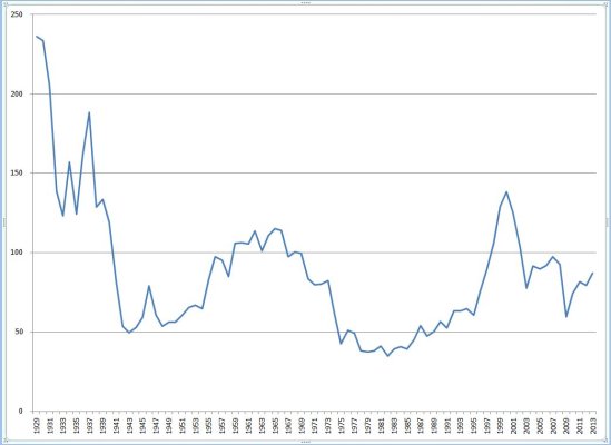
And finally, for another slice at the data, I thought it would be interesting to plot the S&P 500 against GNP (data only available since 1929). (Shiller, who provided some of the source data for these charts, uses PE10 as an indicator, but I thought GNP is another expression of the strength behind the prices, because GNP represents opportunities for expansions of market share, for example):
Source data from Robert Shiller (historical S&P values, and CPI): Online Data - Robert Shiller
and FRED (GNP data): Federal Reserve Economic Data - FRED - St. Louis Fed