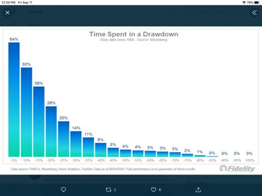
Fidelity presented that chart today showing that where we are at in the market right now is the most common place since 1900...if we rebound from here.
A drawdown is a unique event, not a fluid process. So a 5% drawdown followed by a rebound happens 64% of the time.
If we continue to drop, then the drawdown percentage is a TBD and we end up somewhere down the right side of the chart.