travelover
Give me a museum and I'll fill it. (Picasso) Give me a forum ...
- Joined
- Mar 31, 2007
- Messages
- 14,328
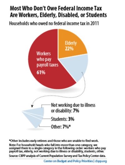
Interesting article showing historical data on where the budget comes from and where it goes, in mostly graphical format.
How We Pay Taxes: 11 Charts - Derek Thompson - The Atlantic
How We Pay Taxes: 11 Charts - Derek Thompson - The Atlantic