IndependentlyPoor
Thinks s/he gets paid by the post
More Geeky stuff, long.
Sorry .
.
The main idea of "modern portfolio theory" seems to be that a combination of uncorrelated assets can produce a portfolio with lower volatility than any of the member assets.
It is not hard to put together some two-fund portfolios to see how this has worked out, so I did.
I wrote a script that creates 11 portfolios of two funds. The percentage asset allocations range from 0/100 to 100/0 in steps of 10. The script calculates and plots the risk/return of each portfolio. The risk is represented by the daily percentage change in NAV; the return is represented by the equivalent APR.
The time period can vary for each plot because for each pair I use the longest period for which data is available for both funds.
Since the crash, we are in a topsey-turvey world. Suddenly, some historically lower-risk, lower-return assets such as bonds are yielding higher than historically higher-risk stocks over reasonably long periods. Risk/return plots look upside-down.
These are just some examples of what the risk/return results have been. I do not mean to imply that these portfolios are in any way better than any others. I haven't tried to use this approach to select optimum portfolios (yet).
Stock/Bond portfolios
For example, here is the risk/return for portfolios of various allocations of Total Stock Market and Total Bond Market.
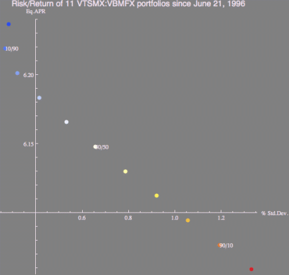
The highest yield occurs at 0% stocks! Even so, adding 10% stock reduces the volatility of the portfolio a little (while also reducing the return). Adding more stock has been a losing strategy. It just increases the volatility and reduces the return.
Bond/Bond portfolios
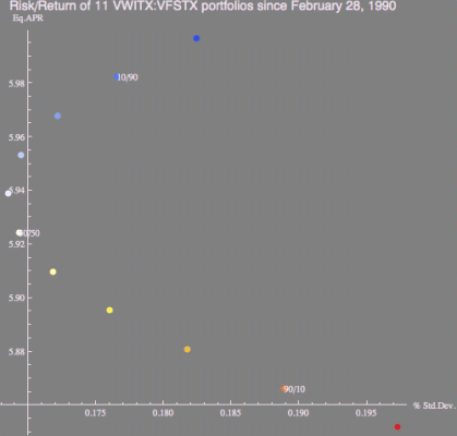
I was surprised to see that even Bond/Bond portfolios displayed the same effects. Here are the results for portfolios of Int. Term Tax-Exempt and Short Term Inv. Grade. However, note that the axes are different and the amount of risk reduction is actually very small. The highest return is 0% Int. Term Tax-Exempt.
Stock/Stock portfolios
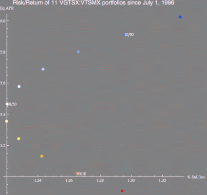
Stock/stock portfolios also show similar behavior. Here are portfolios of Total International Stock and Total Stock Market. The highest return is 0% Total International.
Portfolios containing balanced funds
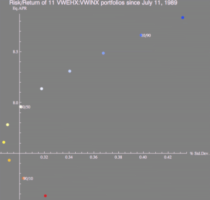
I was also surprised to see that adding the high volatility fund such as High-Yield Corporate to a low volatility fund such as Wellesley can actually reduce the volatility of a well-balanced fund such as Wellesley. It also reduces the return. The highest return is still for 100% Wellesley.
Barbell portfolios
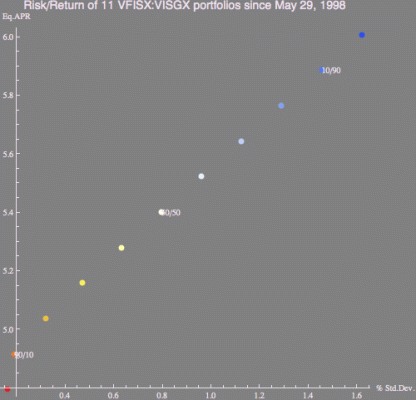
Sometimes combining low-risk bonds with high-risk stocks does not produce lower volatility than the less risky asset. Here, no portfolio of Short-Term Treasury and Small-Cap Growth has lower volatility than the treasuries alone. However, the highest yield is for 100% Small-Cap Growth.
I don't have anything profound to say about any of this. I just thought it interesting.
Sorry
 .
.The main idea of "modern portfolio theory" seems to be that a combination of uncorrelated assets can produce a portfolio with lower volatility than any of the member assets.
It is not hard to put together some two-fund portfolios to see how this has worked out, so I did.
I wrote a script that creates 11 portfolios of two funds. The percentage asset allocations range from 0/100 to 100/0 in steps of 10. The script calculates and plots the risk/return of each portfolio. The risk is represented by the daily percentage change in NAV; the return is represented by the equivalent APR.
The time period can vary for each plot because for each pair I use the longest period for which data is available for both funds.
Since the crash, we are in a topsey-turvey world. Suddenly, some historically lower-risk, lower-return assets such as bonds are yielding higher than historically higher-risk stocks over reasonably long periods. Risk/return plots look upside-down.
These are just some examples of what the risk/return results have been. I do not mean to imply that these portfolios are in any way better than any others. I haven't tried to use this approach to select optimum portfolios (yet).
Stock/Bond portfolios
For example, here is the risk/return for portfolios of various allocations of Total Stock Market and Total Bond Market.

The highest yield occurs at 0% stocks! Even so, adding 10% stock reduces the volatility of the portfolio a little (while also reducing the return). Adding more stock has been a losing strategy. It just increases the volatility and reduces the return.
Bond/Bond portfolios
I was surprised to see that even Bond/Bond portfolios displayed the same effects. Here are the results for portfolios of Int. Term Tax-Exempt and Short Term Inv. Grade. However, note that the axes are different and the amount of risk reduction is actually very small. The highest return is 0% Int. Term Tax-Exempt.

Stock/Stock portfolios
Stock/stock portfolios also show similar behavior. Here are portfolios of Total International Stock and Total Stock Market. The highest return is 0% Total International.

Portfolios containing balanced funds
I was also surprised to see that adding the high volatility fund such as High-Yield Corporate to a low volatility fund such as Wellesley can actually reduce the volatility of a well-balanced fund such as Wellesley. It also reduces the return. The highest return is still for 100% Wellesley.

Barbell portfolios
Sometimes combining low-risk bonds with high-risk stocks does not produce lower volatility than the less risky asset. Here, no portfolio of Short-Term Treasury and Small-Cap Growth has lower volatility than the treasuries alone. However, the highest yield is for 100% Small-Cap Growth.

I don't have anything profound to say about any of this. I just thought it interesting.
