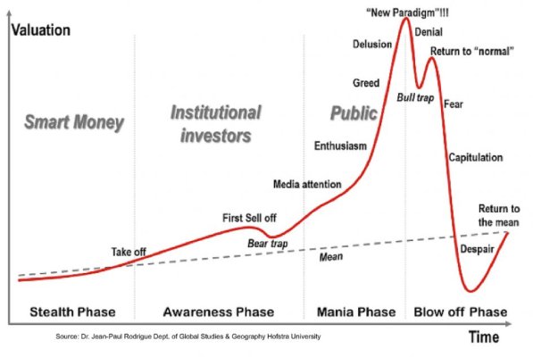
I found this chart trying to explain the market .. what do you think?

cyber888

Thinks s/he gets paid by the post
Joined
Aug 12, 2013
Messages
1,972
So do you agree with this chart? Are we now in the "Return to normal" after the "New Paradigm" and "Denial" and then down
 

Attachments

  • chart123.jpg
    chart123.jpg
    51.3 KB · Views: 96
Last edited:
Well the question is will the continuous Fed spending make this time truly different?
 
I think it's another reason to have an asset allocation, to rebalance when you're out of whack, and to buy into the market with each paycheck during earning years. As I've learned, any other use for such a chart borders on gambling--- you can usually find a guy with a chart of numbers by the roulette table too.

Of course there are lots of places to find spurious correlations: https://www.tylervigen.com/spurious-correlations
 
Last edited:
We never hit the "New Paradigm" phase this time around.

I'd say somewhere between Greed and Delusion.
 
Oh I thought we definitely hit the new paradigm level looking at CAPE10!
 
I'll tell you in a year or two.
 
Pretty much every stock market cycle follows this pattern over the years. Here is another historical view.

IMG_1837.JPG
 
We are pattern-seeking little mammals. Evolution has made us that way because we cannot evaluate every new situation ab initio. The sabre toothed tigers were too fast for that.

The psychologists tell us that our inclination to find patterns causes us to see patterns in random historical data. That is the essence of technical analysis, which is basically astrology for investors.

The OP chart is one explanation of history. There will be many others with no way to tell which is correct. Useless, IOW.


I agree we seek patterns. And I tend to always ignore all the two hundred day moving average, “support”, etc methods.

But I find it fascinating that pretty much in every bear market there is kind of a fake recovery that usually happens multiple times. I don’t know if it is human nature or whatever, but it seems to happen during each bear market at some point.

It would most likely happen this time, but is competing with the Fed going all out.
The jury is still out.
 
Back
Top Bottom