Lsbcal
Give me a museum and I'll fill it. (Picasso) Give me a forum ...
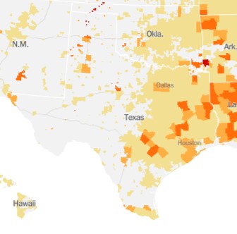
Just looking at the US mapping between Texas and California, they aren't all that different when looked at on a per capita basis:
Texas
California
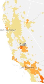
The light yellow areas are something like 1 in 500 people with the virus and the orange is worse with something like 1 in 100 with the virus.
To see the details for your area go to https://www.nytimes.com/interactive/2020/us/coronavirus-us-cases.html
Then set this the map to "per capita".
FWIW, our county in Northern California is at 1 in 498. But trending worse.
LA county is at 1 in 110. Houston is at 1 in 170.
Texas
California
The light yellow areas are something like 1 in 500 people with the virus and the orange is worse with something like 1 in 100 with the virus.
To see the details for your area go to https://www.nytimes.com/interactive/2020/us/coronavirus-us-cases.html
Then set this the map to "per capita".
FWIW, our county in Northern California is at 1 in 498. But trending worse.
LA county is at 1 in 110. Houston is at 1 in 170.