You are using an out of date browser. It may not display this or other websites correctly.
You should upgrade or use an alternative browser.
You should upgrade or use an alternative browser.
Firefox 89 - Who thought this was a good idea?
- Thread starter jim584672
- Start date
Not a fan of the menu spacing. Far too much space, leading to menus/submenus that require scrolling to see the entire contents.
Thankfully, I was using a tailored version of userChrome.css to tweak the menus prior to v89. I needed about 15 minutes or so to figure out how to get around the latest spacing issues. As soon as Mozilla eliminates the ability to use a personal userChrome.css file, I will be moving elsewhere.
Thankfully, I was using a tailored version of userChrome.css to tweak the menus prior to v89. I needed about 15 minutes or so to figure out how to get around the latest spacing issues. As soon as Mozilla eliminates the ability to use a personal userChrome.css file, I will be moving elsewhere.
easysurfer
Give me a museum and I'll fill it. (Picasso) Give me a forum ...
- Joined
- Jun 11, 2008
- Messages
- 13,155
Seems a little like maybe they saw Facebook [-]mess with[/-] improve their look so decided to follow suit.
I don't notice that much of a change except that things are shrunken a bit and now fits in a screen. Not the best for old, tired eyes like me. But doesn't seem too drastic. At least from what I've seen thus far .
.
I don't notice that much of a change except that things are shrunken a bit and now fits in a screen. Not the best for old, tired eyes like me. But doesn't seem too drastic. At least from what I've seen thus far
.I am not sure how Mozilla did it, but they made the navigation buttons even more difficult to view than they were before. This is particularly true for the "Back" and "Forward" arrows, and it has gotten worse over the years (speaking as someone who started with Firefox v0.8 in March 2004). It is really hard to tell whether you have a webpage that you can go backward and/or forward to with those arrows.
Last edited:
target2019
Give me a museum and I'll fill it. (Picasso) Give me a forum ...
I was expecting UI Armageddon when I saw this thread. After applying the update, Firefox improvements look fine to me.
https://www.mozilla.org/en-US/firef...ium=firefox-desktop&utm_campaign=about-dialog
Note that anything you dislike in appearance can probably be changed.
This is my current array of browsers. When I encounter an obstacle, or feel the winds change, I switch to another browser.
https://www.mozilla.org/en-US/firef...ium=firefox-desktop&utm_campaign=about-dialog
Note that anything you dislike in appearance can probably be changed.
This is my current array of browsers. When I encounter an obstacle, or feel the winds change, I switch to another browser.
Attachments
The Cosmic Avenger
Thinks s/he gets paid by the post
I agree, the tabs were very hard to tell apart, so I just reverted: https://www.askvg.com/tip-restore-old-classic-theme-and-ui-in-firefox-89-and-later-versions/
Thanks for the tip, just reverted.I agree, the tabs were very hard to tell apart, so I just reverted: https://www.askvg.com/tip-restore-old-classic-theme-and-ui-in-firefox-89-and-later-versions/
Gotadimple
Thinks s/he gets paid by the post
- Joined
- Feb 17, 2007
- Messages
- 2,616
I am not sure how Mozilla did it, but they made the navigation buttons even more difficult to view than they were before. This is particularly true for the "Back" and "Forward" arrows, and it has gotten worse over the years (speaking as someone who started with Firefox v0.8 in March 2004). It is really hard to tell whether you have a webpage that you can go backward and/or forward to with those arrows.
Have you tried changing the theme - which changes the colors and intensity? See Settings/Extensions & Themes/Themes
Rita
Yes. Most annoying to have to take on wholesale coloring themes just to see the navigation buttons more clearly. I hated that the buttons themselves lost the ability to be customized starting with Firefox v58, but at least I could clearly see whether there were backward and/or forward pages available until v89. The arrows are far too thin, and they keep shrinking with each major design/redesign of Firefox.Have you tried changing the theme - which changes the colors and intensity? See Settings/Extensions & Themes/Themes
easysurfer
Give me a museum and I'll fill it. (Picasso) Give me a forum ...
- Joined
- Jun 11, 2008
- Messages
- 13,155
Usually, I'm one of the first to [-]gripe about [/-] point out a so-called improved new look.
But I actually don't mind the more compressed look. Looks like now I can cram more stuff onto the bookmarks toolbar before having to navigate via drop down.
But I actually don't mind the more compressed look. Looks like now I can cram more stuff onto the bookmarks toolbar before having to navigate via drop down
.Strange that you are getting a more compressed look. For me, everything got spread out (particularly menu spacing), which might be a plus for someone with weak eyes.
But I organized my bookmarks to be able to see them on a page without scrolling, and that got blown out of the water with my move to v89. That's even with the *unsupported* "Compact" density option for the toolbars.
I've managed to customize my userChrome.css file to get around that. I just need to figure out how to make the navigation arrows more usable. I can actually bring up the right-click context menu in the browser, and the navigation arrows are darker there. Not sure why the toolbar isn't the same.
easysurfer
Give me a museum and I'll fill it. (Picasso) Give me a forum ...
- Joined
- Jun 11, 2008
- Messages
- 13,155
Not sure if I'm describing properly or not. But I just counted that I now have 20 icons on the bookmarks toolbar. Then there is the two right pointing angles for the dropdown. Didn't count how much previously, buy I say maybe 15 icons if lucky.
mountainsoft
Thinks s/he gets paid by the post
I agree, the tabs were very hard to tell apart, so I just reverted: https://www.askvg.com/tip-restore-old-classic-theme-and-ui-in-firefox-89-and-later-versions/
Thanks! That at least gets me back to a usable browser, though the window still doesn't show active/non-active status (if the browser window is active or not). It also sounds like this configuration is going away in the next update (July?) so it's probably a short lived fix.
I have several browsers installed and am leaning towards switching to Edge. Honestly, Firefox, Chrome, and Edge basically all look equally bad now. Firefox was about the only one that still offered a traditional menu bar (File-Edit-View-etc.).
I wish these companies would just leave things alone. Every time I get things configured to my liking, they change the interface, break my add-on's, etc.
OldShooter
Give me a museum and I'll fill it. (Picasso) Give me a forum ...
Yeah. Better the devil I know. The overall problem with this type of thing is programmers' confusion of "different" with "better." I think it comes from breathing software development air, like asbestosis comes from the air. It screws up critical thinking.Upgraded FF yesterday... Looks/works fine for me... It's been my preferred browser for many years so I'll stick with it, for now.
I see Micro$oft will soon be giving us "different" too/June 24 announcement. I can hardly wait.
The latter is why I have Vivaldi installed as my backup browser with Firefox. Vivaldi also has improved it's ability to allow some customization compared to when I tried it a couple of years ago.I have several browsers installed and am leaning towards switching to Edge. Honestly, Firefox, Chrome, and Edge basically all look equally bad now. Firefox was about the only one that still offered a traditional menu bar (File-Edit-View-etc.).
teetee
Full time employment: Posting here.
- Joined
- Jul 11, 2019
- Messages
- 679
My Firefox is persistent on (re)opening a pinned tab that I no longer want. And it doesn't happen only after the browser launch. As soon as I unpin a pinned tab and close it, it will respawn like a nightmare that won't go away.
I disabled pretty much every config entries (via about:config) but couldn't change this behavior.
I disabled pretty much every config entries (via about:config) but couldn't change this behavior.
The Cosmic Avenger
Thinks s/he gets paid by the post
Ooooh, I know just enough CSS to be dangerous, I'm going to have to tinker with that.<snip>
I've managed to customize my userChrome.css file to get around that. I just need to figure out how to make the navigation arrows more usable. I can actually bring up the right-click context menu in the browser, and the navigation arrows are darker there. Not sure why the toolbar isn't the same.
zinger1457
Thinks s/he gets paid by the post
- Joined
- Jul 22, 2007
- Messages
- 3,230
Was a long time Firefox user but gave up on it last year, just became too slow. I know Microsoft is considered a no-no by many but their Edge browser is much better than Firefox IMO, so much faster. The only add-ons I use on both are a password manager and an ad blocker.
bjorn2bwild
Thinks s/he gets paid by the post
I am delaying the update for now.
I did save a couple of guides to make modifications if need be -
https://www.userchrome.org/firefox-89-styling-proton-ui.html
https://amitp.blogspot.com/2021/06/firefox-89-tab-appearance.html
I did save a couple of guides to make modifications if need be -
https://www.userchrome.org/firefox-89-styling-proton-ui.html
https://amitp.blogspot.com/2021/06/firefox-89-tab-appearance.html
Graybeard
Full time employment: Posting here.
- Joined
- Aug 7, 2018
- Messages
- 597
I like the change and typically I hate change. The spacing of bookmarks is great, farther apart with a larger font, the old font was tiny and the lines very close together. I have dozens of BM, they are all folders, and I find this new layout to be better. The tab fonts are smaller and I have the tool bar but don't really look at it.
I stopped using FF a couple of years ago. Chrome and Brave are fast, FF is literally less than half the speed of them! I have done many speed tests over the past 2 years and FF is just so slow it is painful - ie 94 mbps with Chrome and Brave but 42-47 mbps with FF. All I use FF for now is to get around having to turn off my ad blocker to be able to see a site. I use Reader Mode in FF and can then read it.
I stopped using FF a couple of years ago. Chrome and Brave are fast, FF is literally less than half the speed of them! I have done many speed tests over the past 2 years and FF is just so slow it is painful - ie 94 mbps with Chrome and Brave but 42-47 mbps with FF. All I use FF for now is to get around having to turn off my ad blocker to be able to see a site. I use Reader Mode in FF and can then read it.
RetiredAt55.5
Full time employment: Posting here.
Yeah. Better the devil I know. The overall problem with this type of thing is programmers' confusion of "different" with "better." I think it comes from breathing software development air, like asbestosis comes from the air. It screws up critical thinking.
I see Micro$oft will soon be giving us "different" too/June 24 announcement. I can hardly wait.
I beg to differ - these design decisions aren't made by the programmers (at least not in my IT jobs).
The artsy fartsy design teams came up with these stylistic, navigation, and appearance "improvements". We were just innocent bystanders told to implement them, and we complained about them ourselves.
I like the new look better than the old. Mostly because of the brighter colored window theme. The previous window title bar (various tabs) was black and has been updated to light gray. I found the black title bar lead to more accidental window focus clicks. As many webpages now use a dark theme, causing the title bar to disappear into the background of another overlapping window. Now it is much easier to navigate IMO.
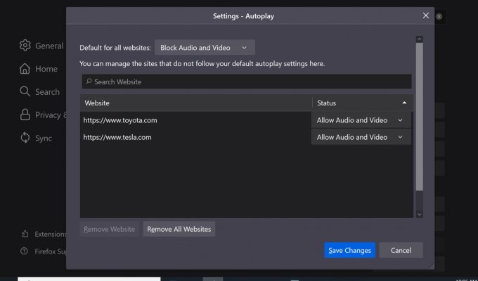
My biggest gripe applies to both Chrome and FF. I hate that they both auto-play and float any video on the page (mainly ads). Muting the sound is the only option and they intentionally make it difficult to manage. I have actually started playing with the new browser Brave, which allows you to turn off auto-play, but the jury is still out as to if it is overall better or not.
The Cosmic Avenger
Thinks s/he gets paid by the post
FF has had this for a while, under Privacy & Security > Permissions:My biggest gripe applies to both Chrome and FF. I hate that they both auto-play and float any video on the page (mainly ads). Muting the sound is the only option and they intentionally make it difficult to manage. I have actually started playing with the new browser Brave, which allows you to turn off auto-play, but the jury is still out as to if it is overall better or not.
Attachments
Similar threads
- Replies
- 10
- Views
- 425
- Replies
- 12
- Views
- 520
- Replies
- 21
- Views
- 985