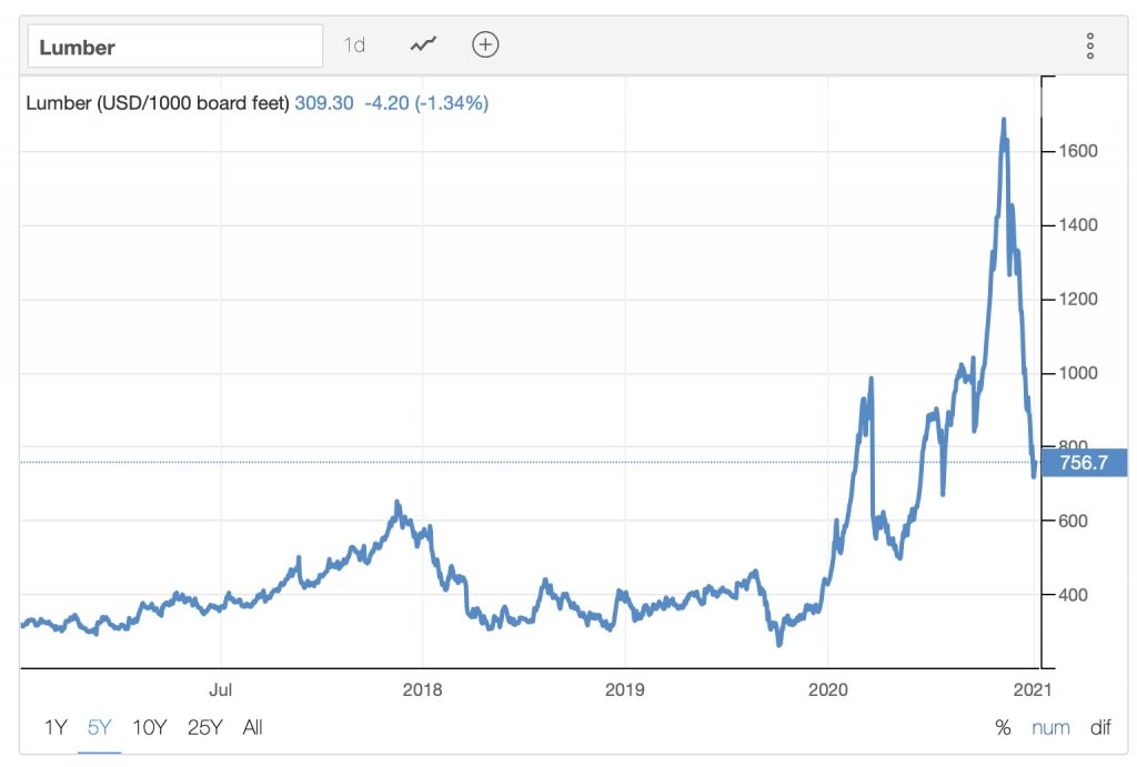
I've been trying to think of a better way to express this. Maybe a visual will help. Here's a graph of a random commodity (lumber) I pulled off the web:
Looking at this chart, I don't think anyone is going to say "Wow! That's pretty dramatic deflation!"
They're going to see a spike, and conclude prices are still high. If prices stabilize at the current (per the chart) price, I think any rational person would call that
inflation, not
deflation.
If you want to claim that, semantically, the downward part of that line is technically deflation, fine. But I'd say you're either being pedantic, or downright dishonest.
Just to be clear, I chose this chart only because it shows an exaggerated example of what I've been trying to explain. I know it's not representative of the broader economy. This is a hypothetical discussion about how to define deflation, not a statement on our current status. For that, only time will tell.