I guessed at Late Moderates based on the first link you provided, since so many sectors are positive at the moment, as on that table. This new one is interesting, too, thanks. I like these sorts of big picture macro cycles concepts as a framework for the financial news.
Ok, I understand better. There is a pdf with clearer graphics and more explanation.
The Business Cycle Approach to Asset Allocation
https://institutional.fidelity.com/app/literature/view?itemCode=943044&renditionType=pdf&pos=na
The Business Cycle Approach to Equity Sector Investing
https://institutional.fidelity.com/app/literature/view?itemCode=943044&renditionType=pdf&pos=na
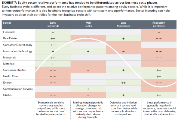
From the 2nd link in this post (above), I copied a clearer picture of Exhibit 7. It's similar to the graphic on Fidelity's web page. So we're looking at a generalized summary of a typical business cycle. As you pointed out, we're in the third stage. Other Fidelity graphics show that we are almost in the Recession stage.
The chart is ranking the sectors in this way:
++ green shading, greatest outperformance in the stage.
+ green shading, outperforms.
empty white shading, no pattern of outperformance.
- red shading, underperforms.
-- red shading, greatest underperformance.
It is an interesting puzzle, for sure. You can trace your sector fund, or individual company, and determine if it is just like an average Energy company or fund. Or maybe my sector fund or individual company is more diversified, and has interests that mitigate its underperformance periods.
")