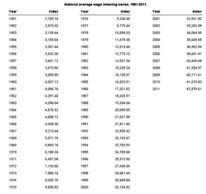
The chart below, represents a history of average wages that Social Security uses to develop pay out amounts. National Average Wage Index
It may be interesting to put into perspective your own salary progress (during the working years) relative to the national average. By coincidence, my first job was in the first year shown on the chart. Last year was 1989.
In looking for national statistics, almost all government charts and tables are either overly selective... quintiles, median, household, race, state, family, etc... and few give a good, longer term historical values. This is one of the few that gives a broad overview.
As they say, "your mileage many vary!"