What does this look like?
http://www.speculativebubble.com/images/homevalues1.gif
Can not attach - gif to large.
http://www.speculativebubble.com/images/homevalues1.gif
Can not attach - gif to large.
macdaddy said:rational exuberance?
")
sgeeeee said:It's hard to tell withoutmore detail, but I wonder if things like house size and features are taken into account.
I would guess that the average house today is more than twice the square footage of the average house in 1890.
PPT said:What does this look like?

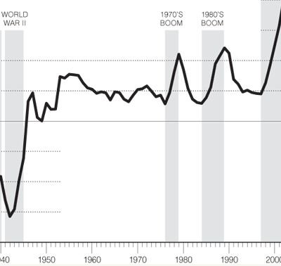
TromboneAl said:Sure looks bad. Of course, if I'd seen this curve at the end of 2001, I'd have said a correction was imminent (IOW you never can tell):
Am I missing something? I don't see why you assume that house prices are outstripping wage growth. Does anyone have more description of what Shiller is actually plotting here?PPT said:I just do not see how housing prices can outpace wage growth so greatly.
I would hate to be a 18 year old looking for a place to live now.
sgeeeee said:Am I missing something? I don't see why you assume that house prices are outstripping wage growth.
Homeowners enjoyed an average increase of 54.4 percent in the value of their houses between 2001 and 2005
PPT said:I can safely tell you my salary did not go up 54.4% from 2001 to 2005.
Yeah, if you break down the period of the OPs original chart, here's what you find:al_bundy said:i'd say in the last 10 years housing has easily outstripped wage growth
sgeeeee said:Yeah, if you break down the period of the OPs original chart, here's what you find:
1890 to 1994
CPI went up 1580%
unskilled wages went up 7943%
housing went up 10%
then from 1994 to 2005
CPI went up 32%
unskilled wages went up 42%
housing went up 81%
So if you only look at the last decade, you can find reason to worry.
http://www.thetrumpet.com/index.php?page=article&id=3118U.S. mortgage default rates hit an all-time high in the first quarter of 2007. Rising delinquencies will add additional pressure to a slowing housing market.
sgeeeee said:Yeah, if you break down the period of the OPs original chart, here's what you find:
1890 to 1994
CPI went up 1580%
unskilled wages went up 7943%
housing went up 10%
then from 1994 to 2005
CPI went up 32%
unskilled wages went up 42%
housing went up 81%
So if you only look at the last decade, you can find reason to worry.
)