Running_Man
Thinks s/he gets paid by the post
- Joined
- Sep 25, 2006
- Messages
- 2,844
Since the P/S trend has been going up for many years, what makes you think it will change NOW?
I am not sure to whom your question was directed, but in case it was meant for me, I will answer.
No, I did not make any comment about what the P/S will do. I only noted that higher profit margins (earnings to sales) do not mean that stocks are necessarily more expensive.
Companies have been able to get higher margins out of their sales than they did 50 years ago. How or why? An economist can write a book about that.
")
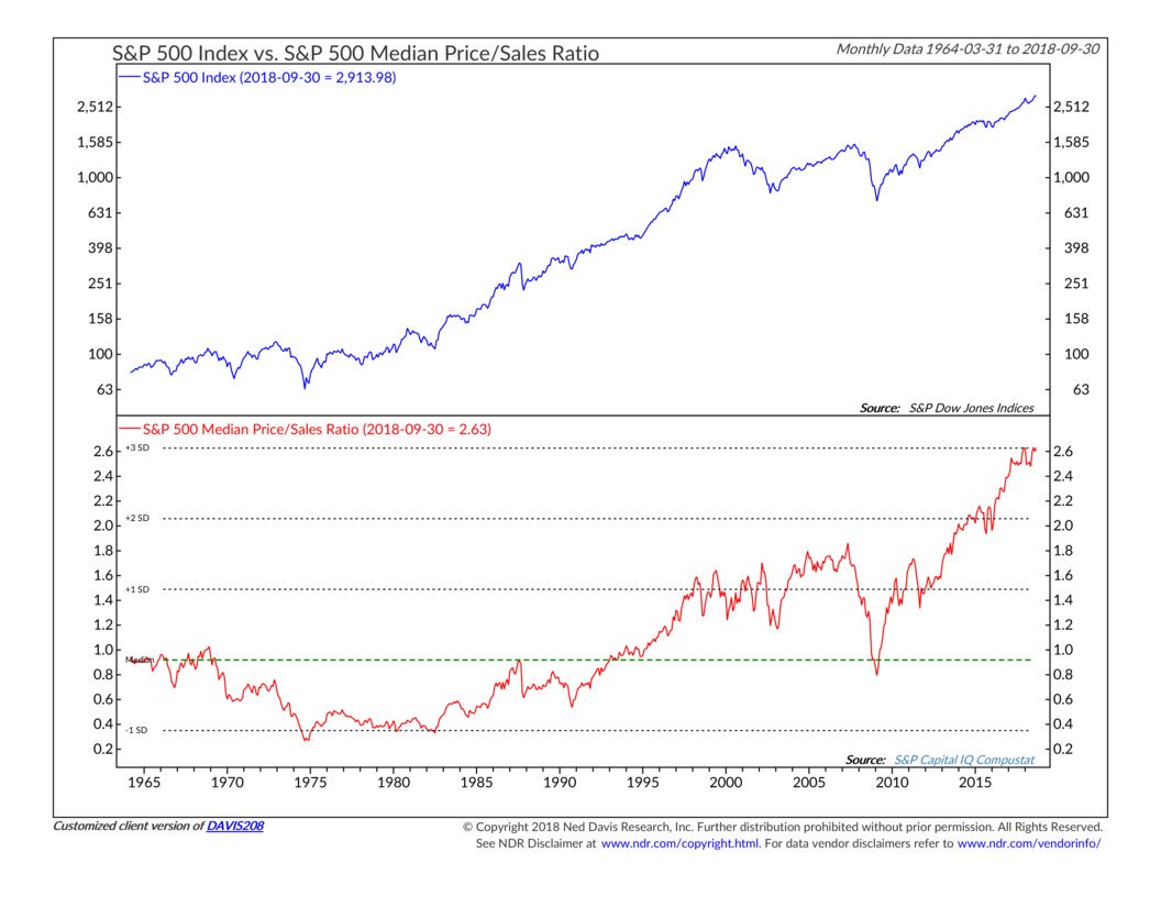
Earnings as a matter of practice fluctuate greatly, sales have a staying power for the most part especially if you are speaking of the 500 largest companies. If the world really valued the S&P500 by earnings the fluctuation would be quite great:
Earnings for the S&P 500:
Jun 30, 2018 122.70
Dec 31, 2017 112.52
Dec 31, 2016 98.86
Dec 31, 2015 92.35
Dec 31, 2014 109.99
Dec 31, 2013 108.54
Dec 31, 2012 95.11
Dec 31, 2011 97.26
Dec 31, 2010 89.09
Dec 31, 2009 59.58
Dec 31, 2008 17.87
Now Sales By Year:
Jun 30, 2018 1,292.84
Dec 31, 2017 1,231.57
Dec 31, 2016 1,150.68
Dec 31, 2015 1,127.13
Dec 31, 2014 1,163.32
Dec 31, 2013 1,116.81
Dec 31, 2012 1,092.37
Dec 31, 2011 1,052.83
Dec 31, 2010 962.71
Dec 31, 2009 908.40
Dec 31, 2008 1,042.46
So since 2008 you have had 2.2% annual sales growth for the S&P 500. That is a very limiting force on earnings. The forward optimism on earning on the S&P 500 to give it the current PE in the face of increasing interest rates, labor costs and transportation costs is one of the signs of a top in the market place.
https://www.cnbc.com/2018/10/31/wages-and-salaries-jump-by-3point1percent-highest-level-in-a-decade.html
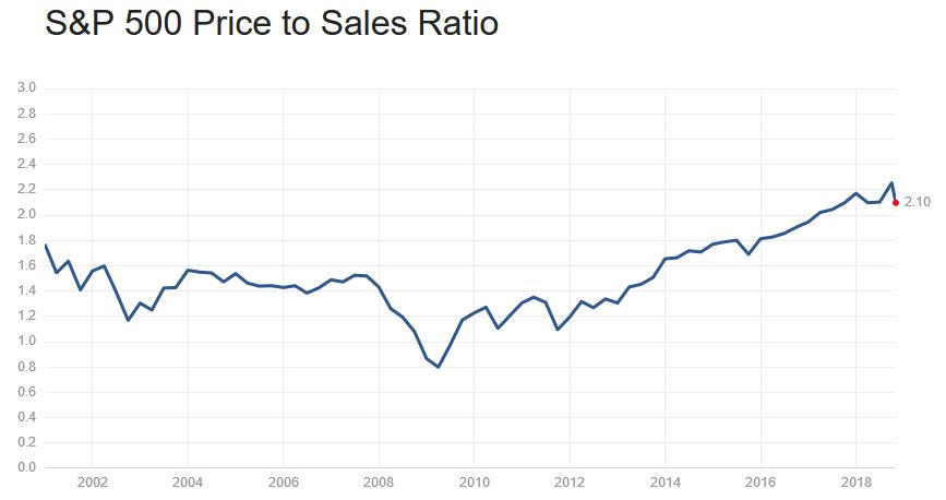
It is information about relative valuation of the stock market, while there is nothing specifically actionable about the chart, it indicates to me as does the PE-10 ratio that stock market valuations are high.Is there anything actionable about that P/S chart? Or is it just a curiosity?
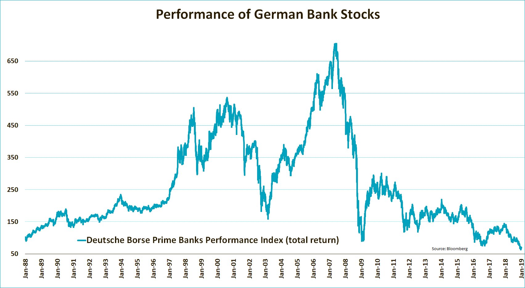
A nice passive index in the companies that provide growth to the entire European continent and expand around the world! This is total return including dividends!
I thought it was an interesting chart, that over 30 years net all the banks in the country of Germany would have a long time negative performance. It is a comment on the state of finance in Europe I would think if banks cannot produce an investment return over 30 of the most prosperous years of history and as of right now is down over 90% from the peak.
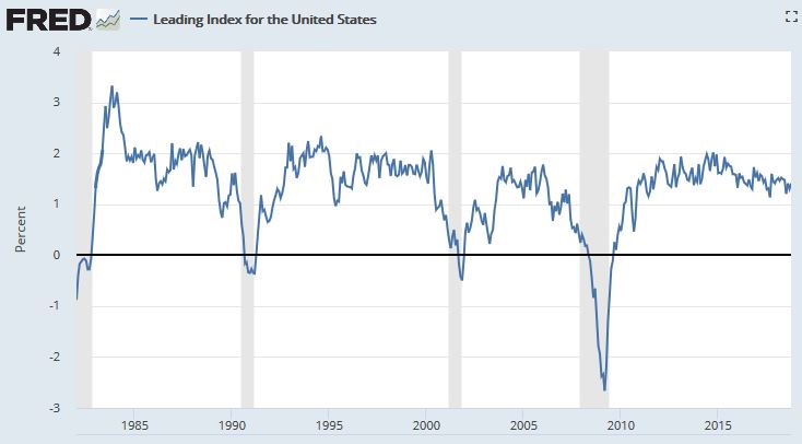
The leading index for each state predicts the six-month growth rate of
the state's coincident index. In addition to the coincident index, the
models include other variables that lead the economy: state-level
housing permits (1 to 4 units), state initial unemployment insurance
claims, delivery times from the Institute for Supply Management (ISM)
manufacturing survey, and the interest rate spread between the 10-year
Treasury bond and the 3-month Treasury bill
I thought it was an interesting chart, that over 30 years net all the banks in the country of Germany would have a long time negative performance. It is a comment on the state of finance in Europe I would think if banks cannot produce an investment return over 30 of the most prosperous years of history and as of right now is down over 90% from the peak.
Here is my chart of the day. Hope Runningbum does not mind another contribution:
I do not know what Runningbum thinks but RunningMan likes it!
Here is my chart of the day. Hope Runningbum does not mind another contribution.
...
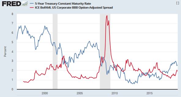
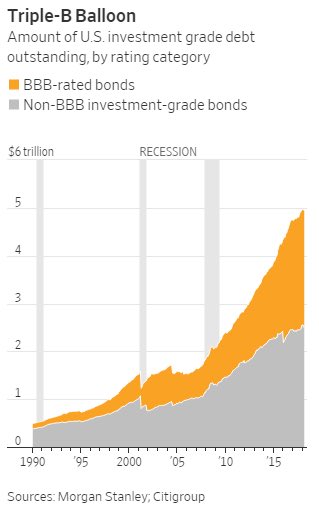
Lowest quality investment grade debt is not only rising as a % of total investment grade debt but investment grade debt in US to GDP has gone from GDP 10 times IGD in 2008 to 3.9 times IGD in 2018. In 1990 before the FED embarked on its long decline of interest rates the ratio was 14.5 times (BBB was about 10% of total investment grade debt.